
About AFK Gaming
Industry: Esports / Gaming Media
Scope:• Brand Identity System • Mascot Design • Style Guide • Digital & Print Assets
AFK Gaming is a leading esports media platform covering tournament hosting, live streaming, game news, and guides across multiple gaming titles and communities. Based in India, the platform had established a strong and loyal following before expanding into new content formats and verticals that each came with their own audiences and visual expectations.
The project covered a full brand redesign, from the logo and identity system through to a character icon, brand guidelines, and a complete suite of digital and print assets.

A Brand That Had Outgrown Itself
AFK had built a recognisable presence in the Indian gaming community, but the brand around it hadn't kept pace with how the platform had grown. What started as a news and guides site now encompassed live tournament coverage, streaming, and original content across multiple gaming communities, each with their own visual culture and audience.
The brand needed to make sense across all of it while still feeling like one coherent platform. Not a collection of separate verticals loosely tied together, but a single identity with enough flexibility to stretch across very different contexts without losing itself.
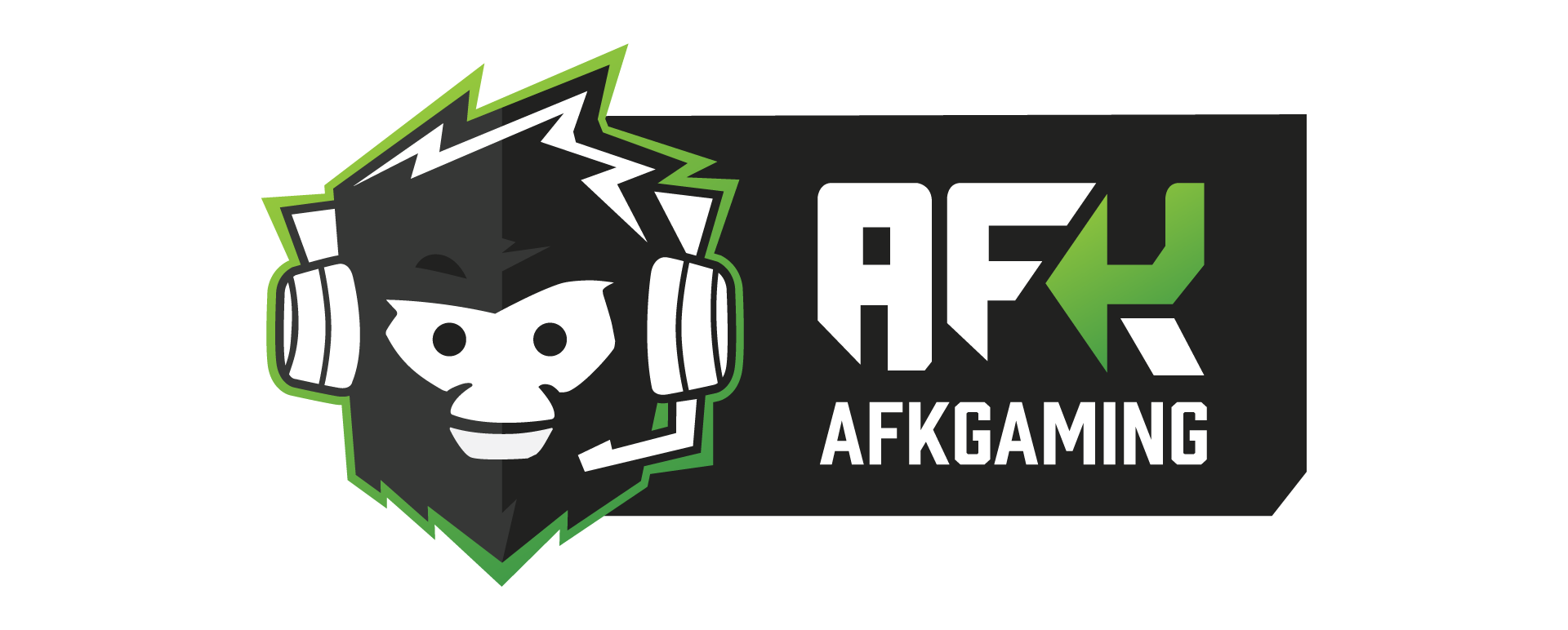
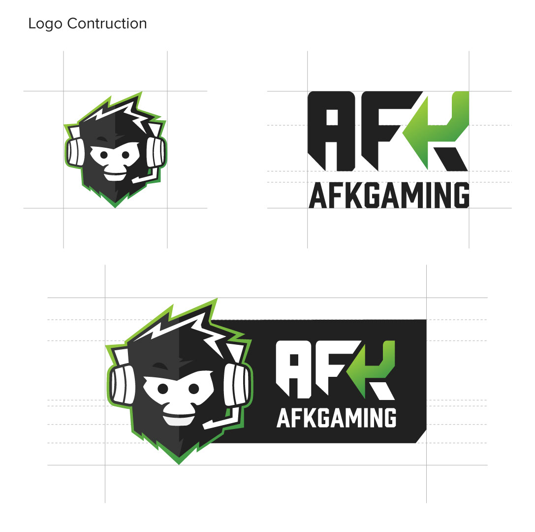
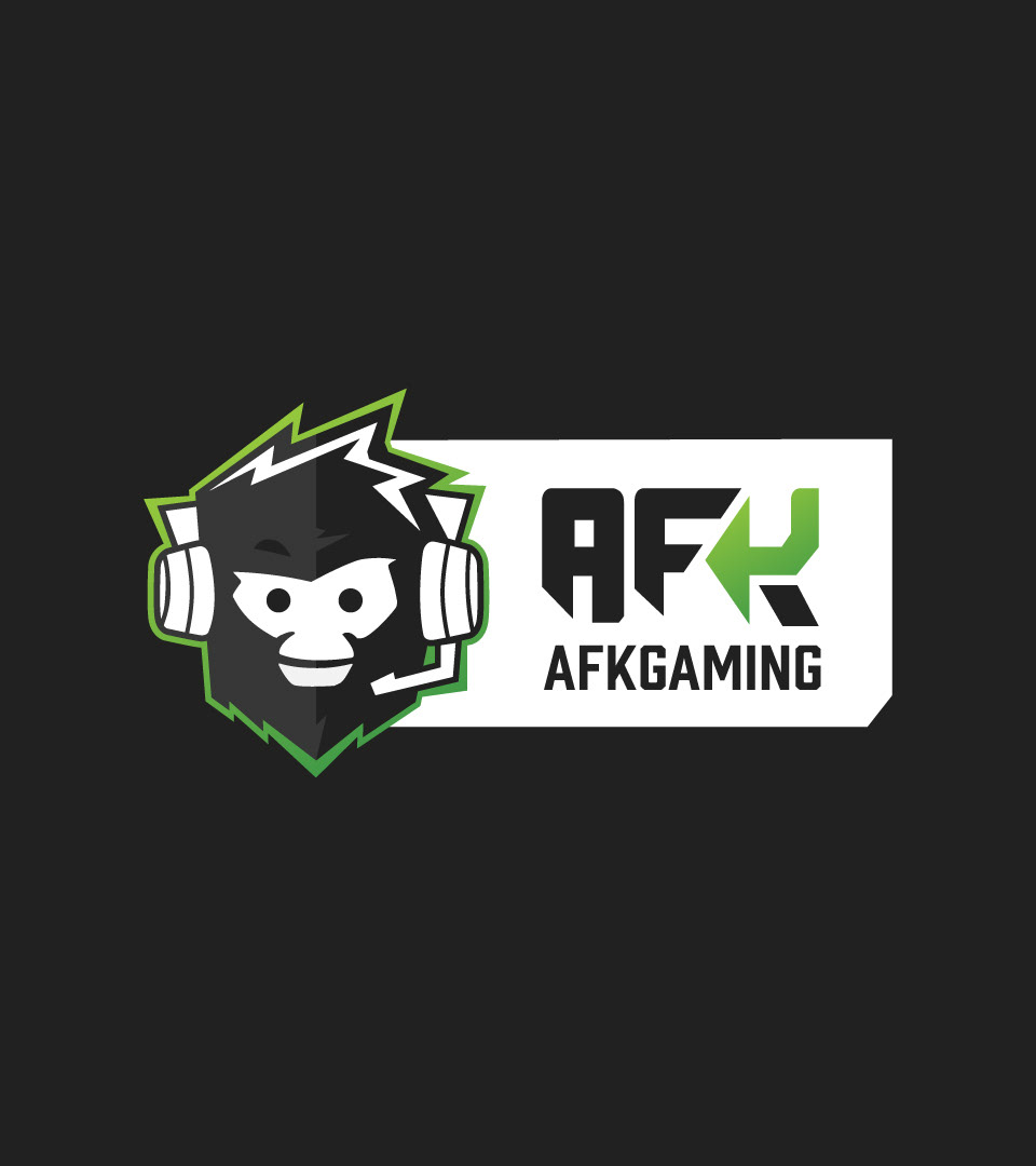
Giving the Brand a Face
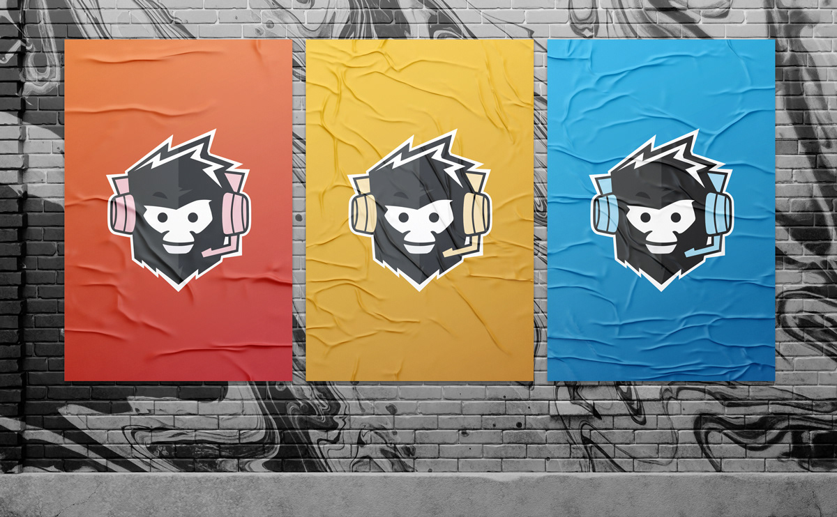
Esports builds deep audience loyalty partly through character. The games and titles AFK covered were full of iconic figures that audiences attached to emotionally, and it felt right for the platform itself to have something of its own in that space. A character icon was developed alongside the identity system, designed to feel at home in the visual language of competitive gaming.
Rather than a single static image, a range of expressions and poses were created so the icon could shift in energy depending on context, moving between tournament coverage, editorial content, and streaming without losing recognisability. The same character, different registers.
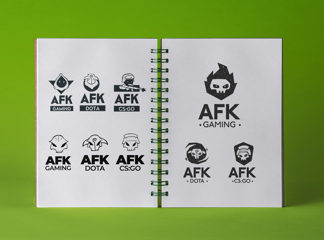
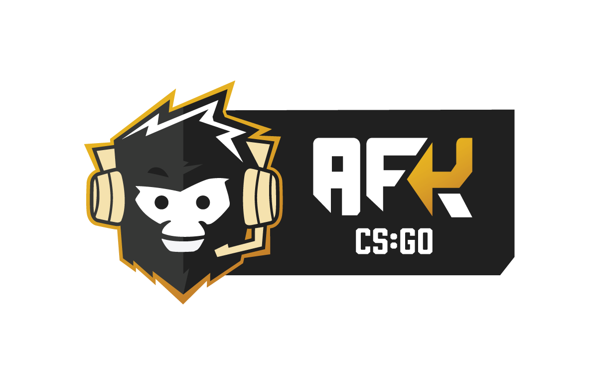
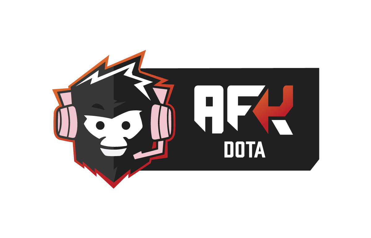
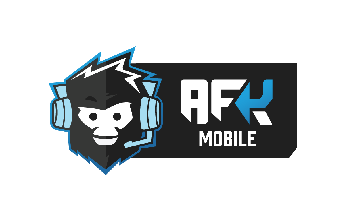
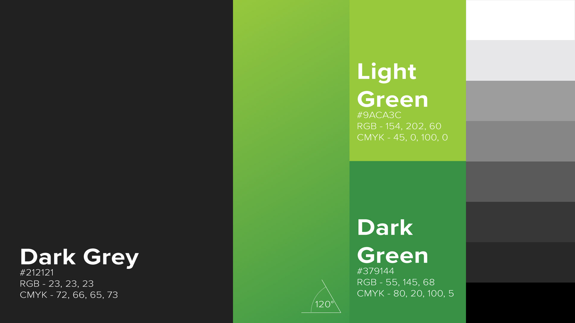
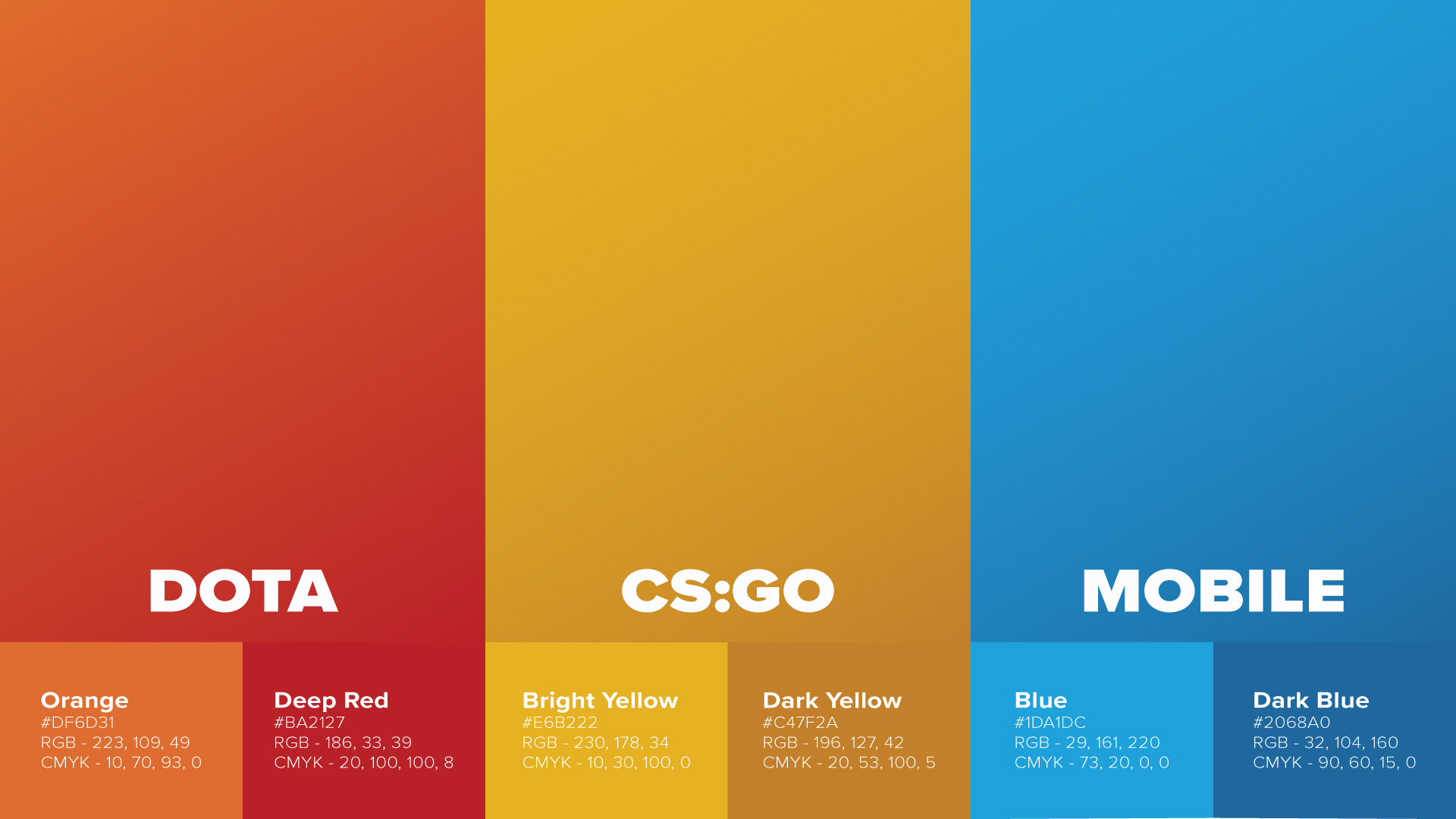
Building the System
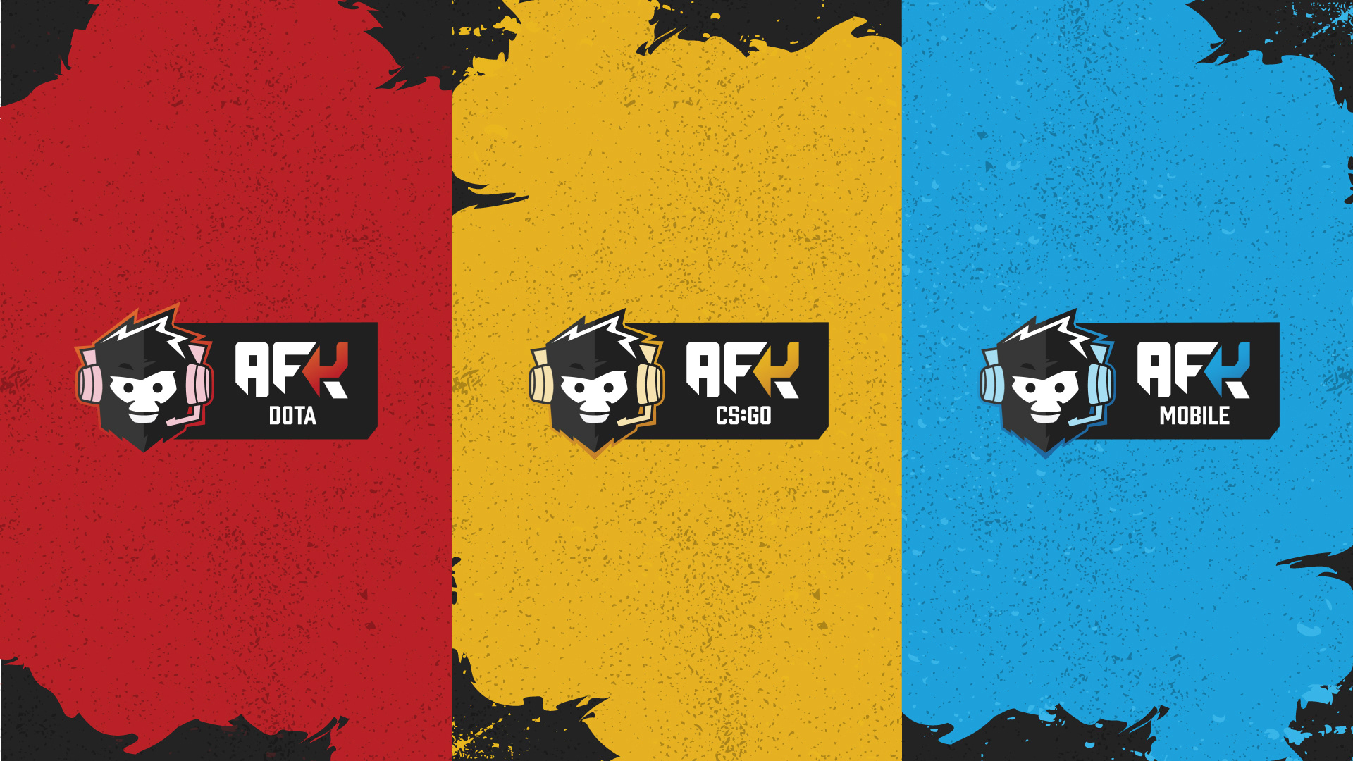
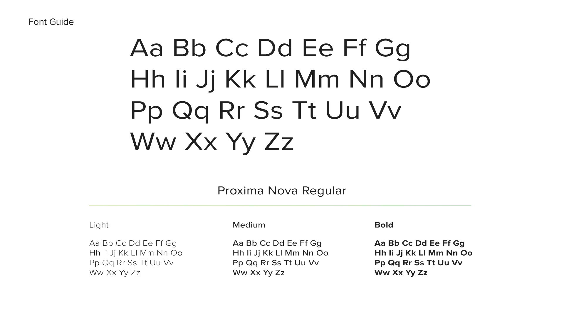
The redesign was structured as a layered system. A strong master brand sits at the centre, with sub-brands that flex to fit each gaming vertical while remaining clearly part of the same family. Each vertical has its own colour language drawn from its game community's visual world, while the underlying grid and typography stay consistent throughout.
The result is an identity where the verticals feel individual and the platform feels unified. A brand with enough range to cover very different content without fragmenting into something unrecognisable.
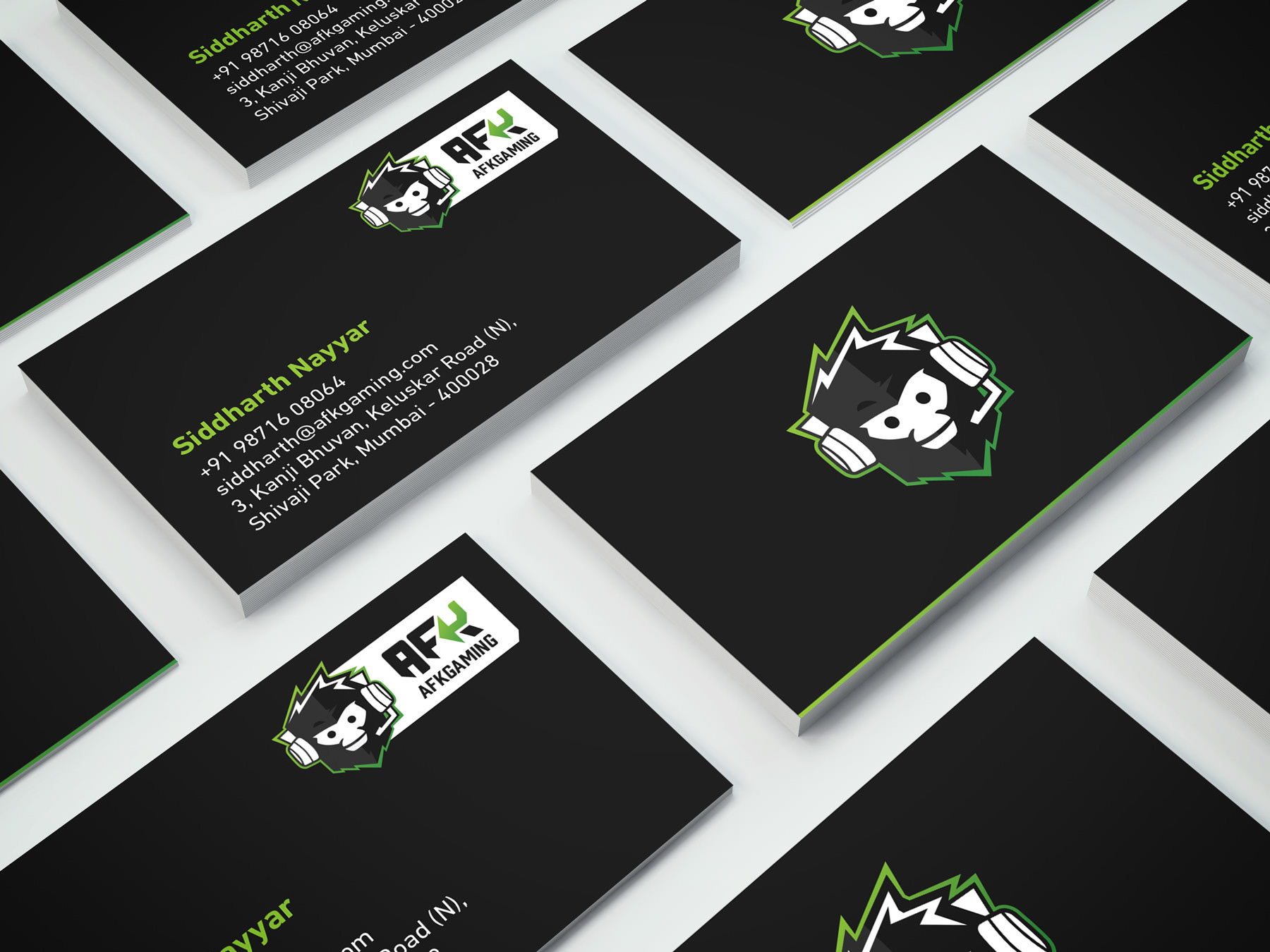
Across Every Surface
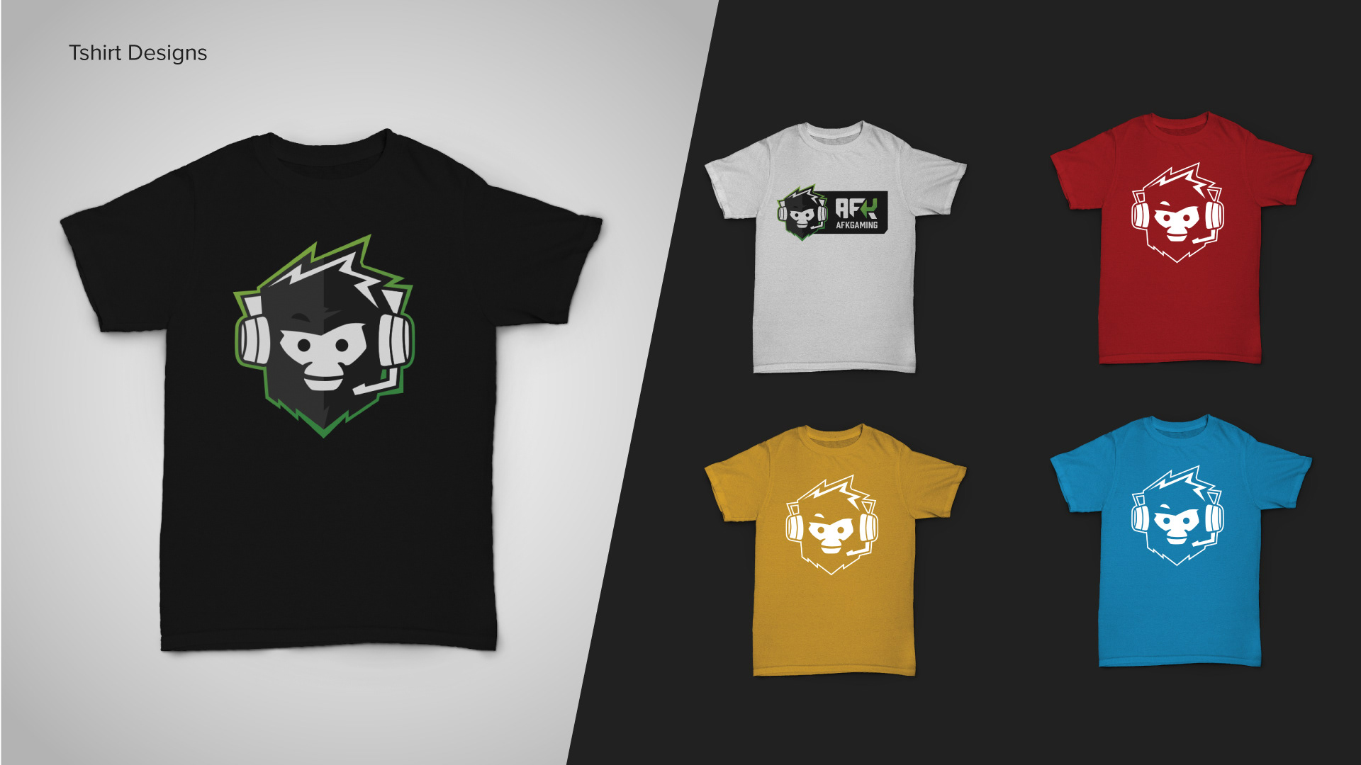
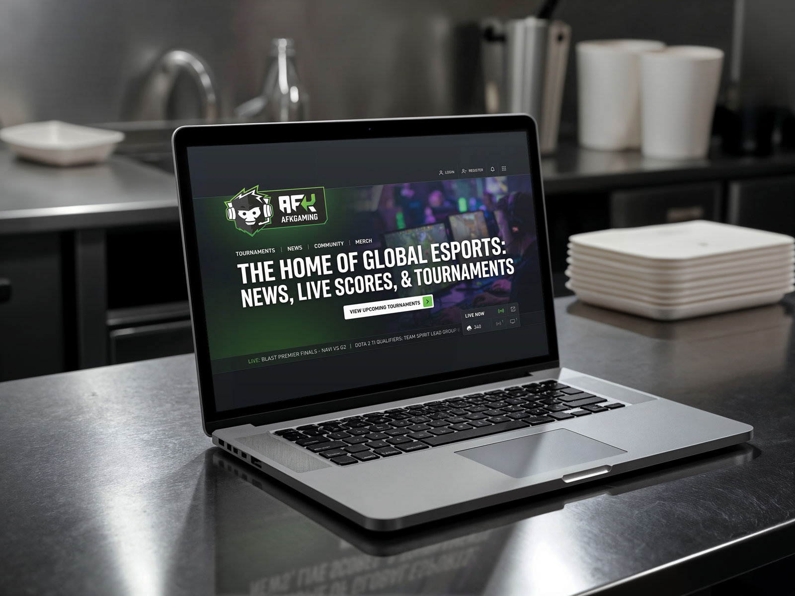
The identity was extended across the full scope of AFK's output. Social media templates, YouTube thumbnails and banners, event posters, livestream overlays, and presentation decks were all developed as part of the system. Merchandise including caps, t-shirts, and bags brought the identity into physical form. A comprehensive brand guidelines document was produced to give the internal team a reliable framework for ongoing content production.
Every touchpoint was considered as part of the same system. The same visual logic that informed the character icon carried through into the social assets, and from there into the merchandise.


How It Landed
The redesigned identity gave AFK a consistent visual language across all its verticals and content formats. The character icon added a dimension of personality the platform hadn't had before, resonating particularly well with streaming and tournament audiences. The brand guidelines gave the internal team a framework that made ongoing production more consistent without needing to revisit the foundations each time.
The work has continued to be used and built upon since delivery, which is generally the best measure of whether a design system has done its job.