
About the Institute for Transformative Technologies
Industry: Global Development / Policy Research / Nonprofit
Scope:•Editorial Design • Report Layout • Information Design • Data Visualization • Print & Digital Publication Design
The Institute for Transformative Technologies (ITT) is a research organisation focused on practical solutions for human development. This report examined how artificial intelligence and data analytics could realistically contribute to the UN Sustainable Development Goals across areas including health, food security, energy access, and education. It also introduced the Data Density Index, a framework for assessing how ready different countries are to use data effectively.
The Brief
A long-form research report covering complex analytical frameworks, data sets, and long-form writing, aimed at a mixed audience of policymakers, funders, and academics. The challenge was to create a layout system that could serve all of them, guiding different readers through dense material in a way that felt clear and considered without losing the depth the content required.
ITT had an existing brand identity. The brief was to work within it while developing a visual language for the report that could handle the full range of content it needed to carry.
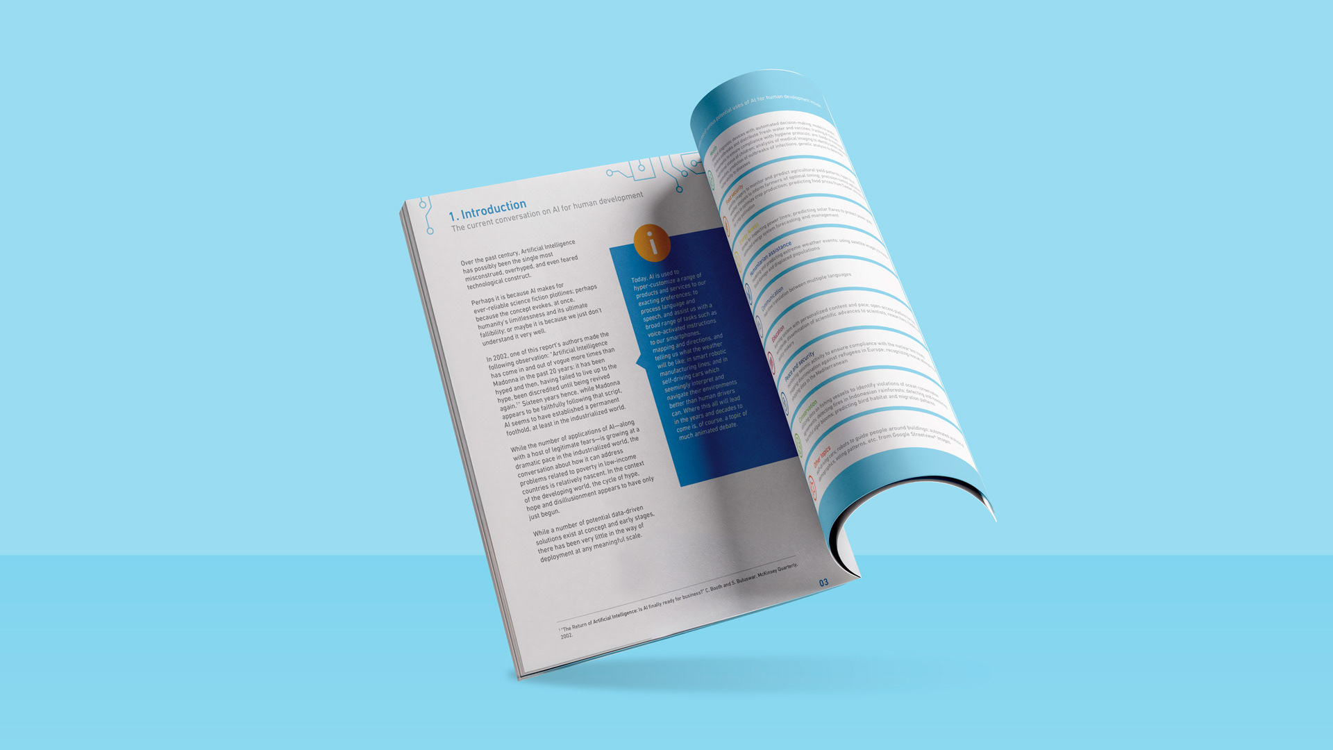
Building the Layout System
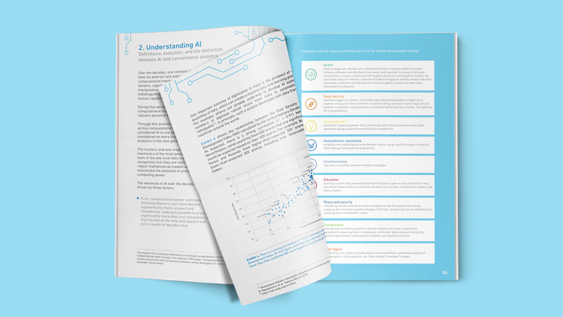
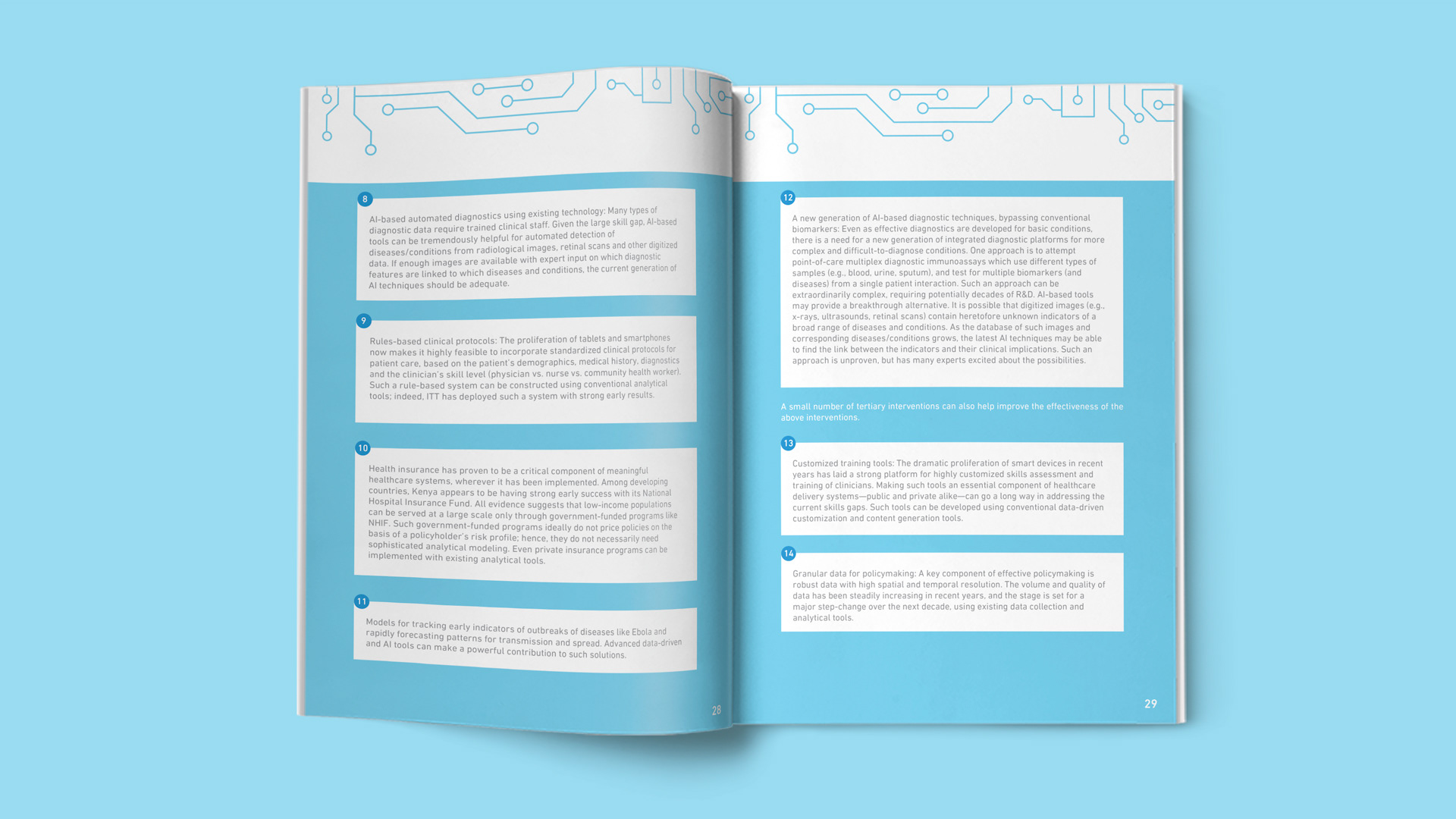
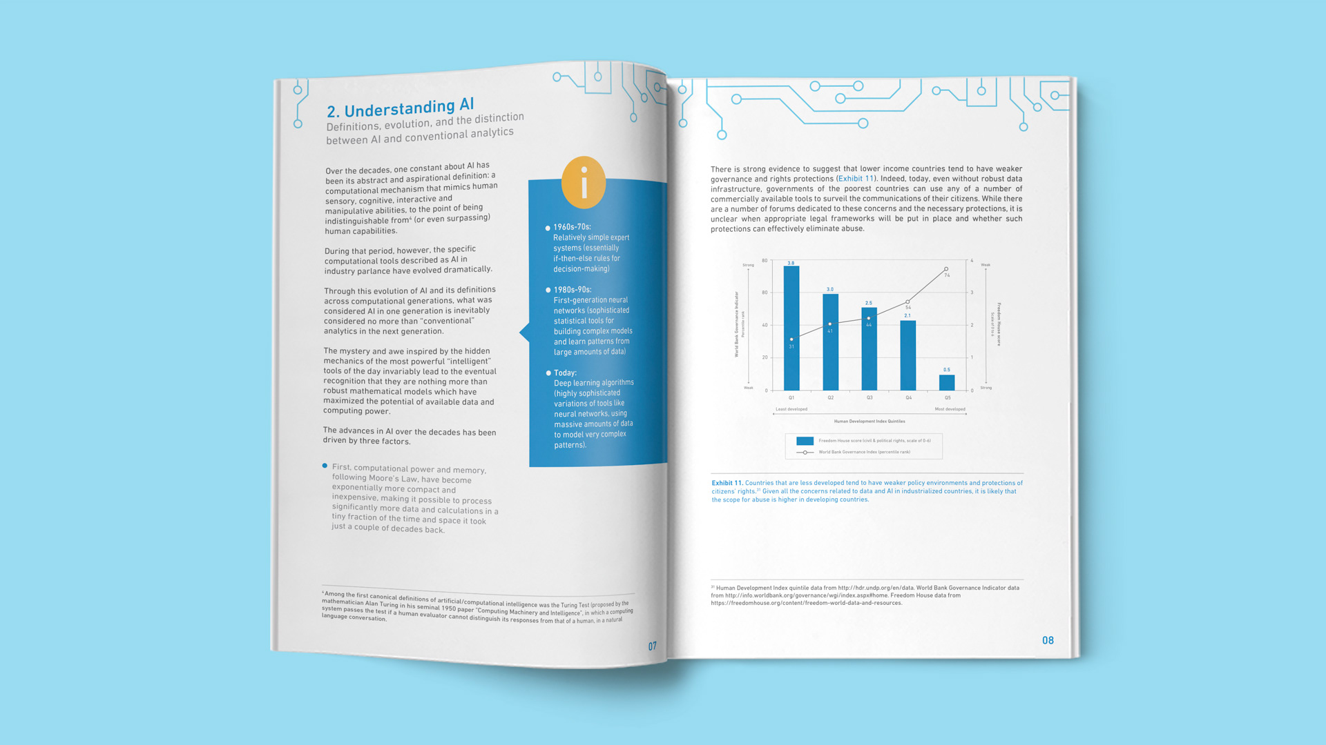
A document of this length and complexity needs a layout system that can flex across very different types of content without losing coherence. The report included smaller supporting graphs, larger data visualisations, pull quotes, highlighted frameworks, and long stretches of analytical writing, sometimes all within a few pages of each other.
The layout was built to give each content type its own clear treatment while keeping the overall reading experience consistent. Section hierarchy, typographic rhythm, and the use of space were all considered as tools for helping different readers navigate the document at their own pace, whether reading cover to cover or dipping in for specific sections.
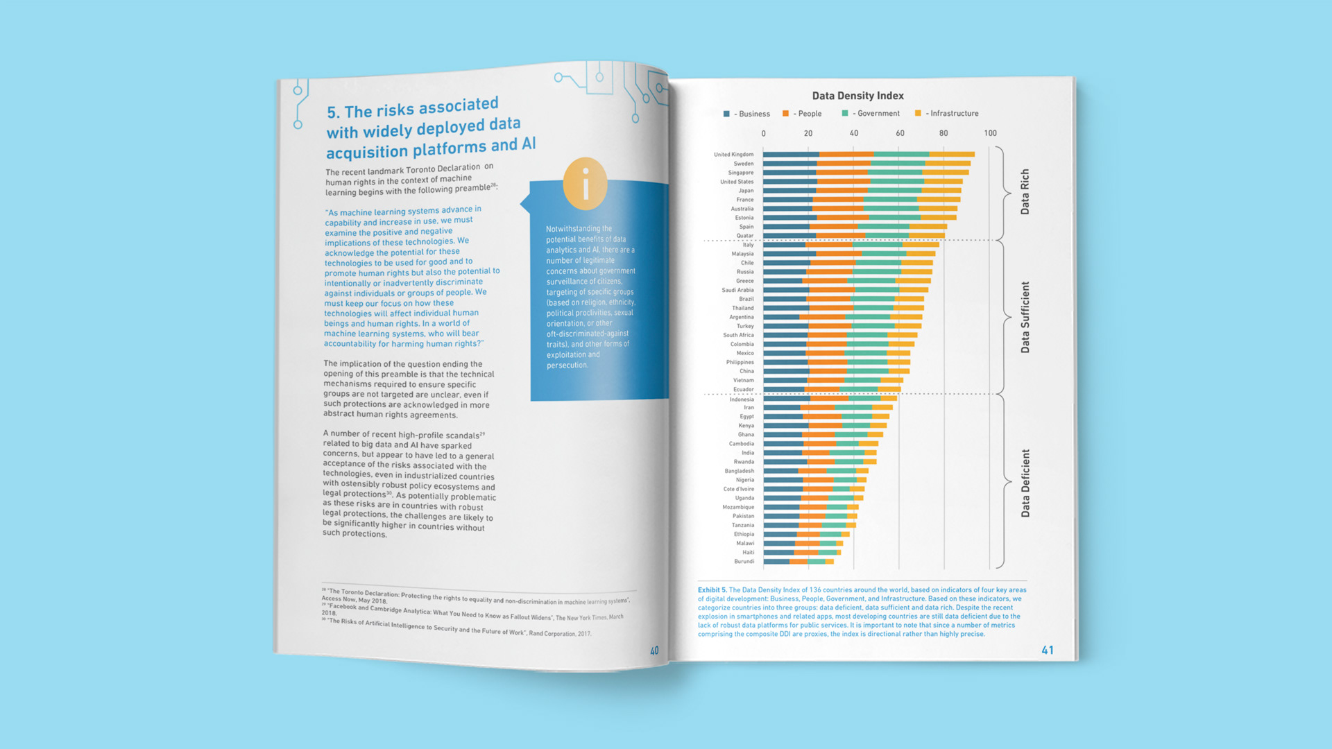
Data Visualisation
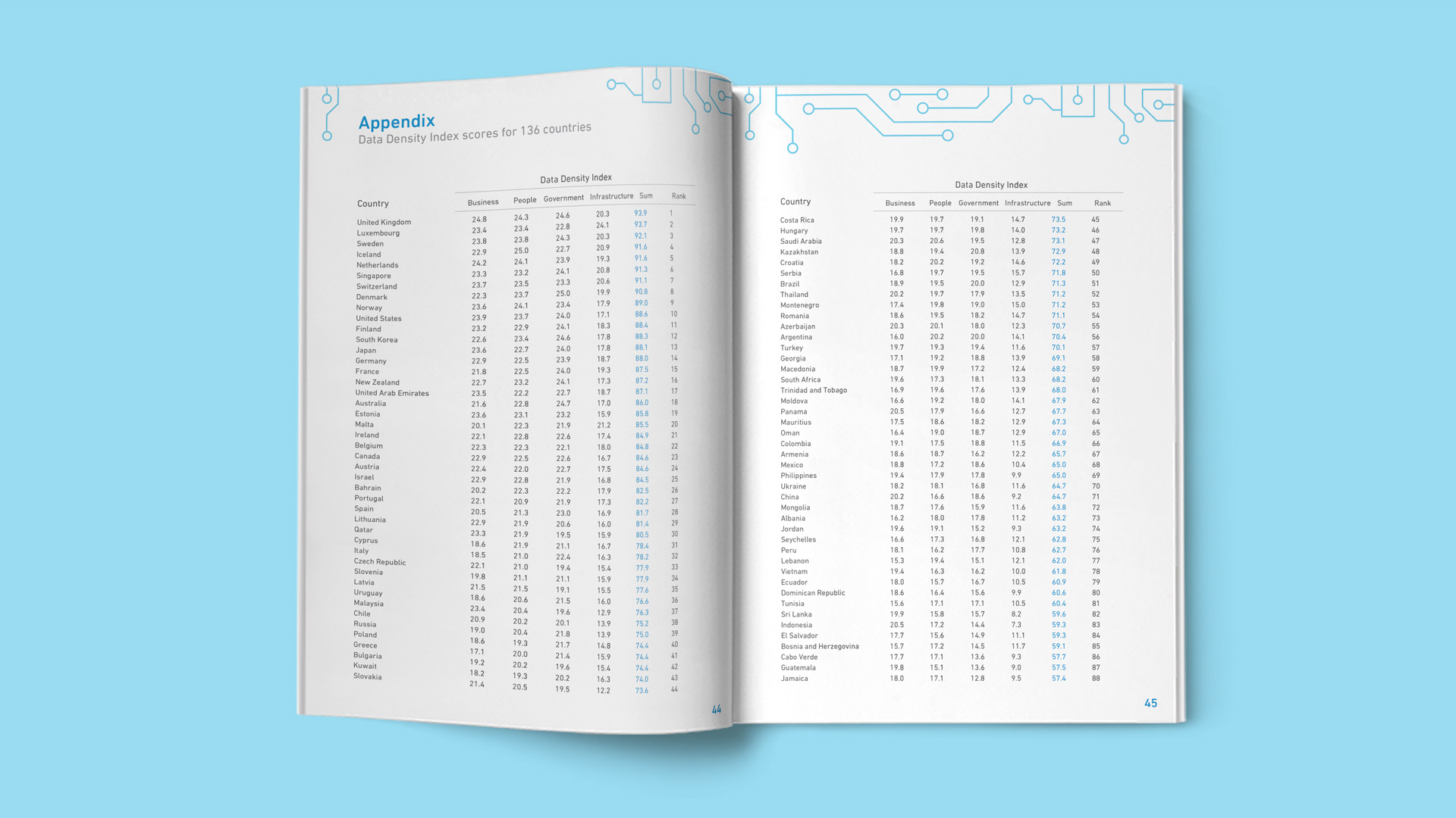
The data for the report arrived as a mix of spreadsheets and rough graphs. Each one had to be either redesigned or built from scratch to align with the brand identity and sit cleanly within the layout system. The visualisations had to be accurate and rigorous enough for an academic audience while remaining readable for a policy or funding context where not every reader would approach the data with the same level of technical familiarity.
The Data Density Index, one of the report's central original frameworks, required particular attention. Translating an analytical model into a visual form that communicated clearly