

About Corona Quilt Project
Industry: Arts / Community / Social Impact
Scope: Brand identity · Logo design · Style guide · Website design · Print materials · Multilingual campaign assets
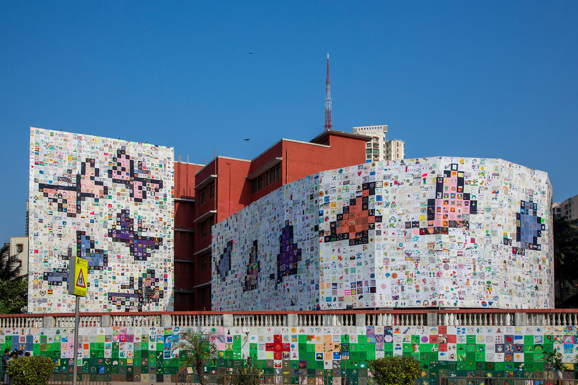
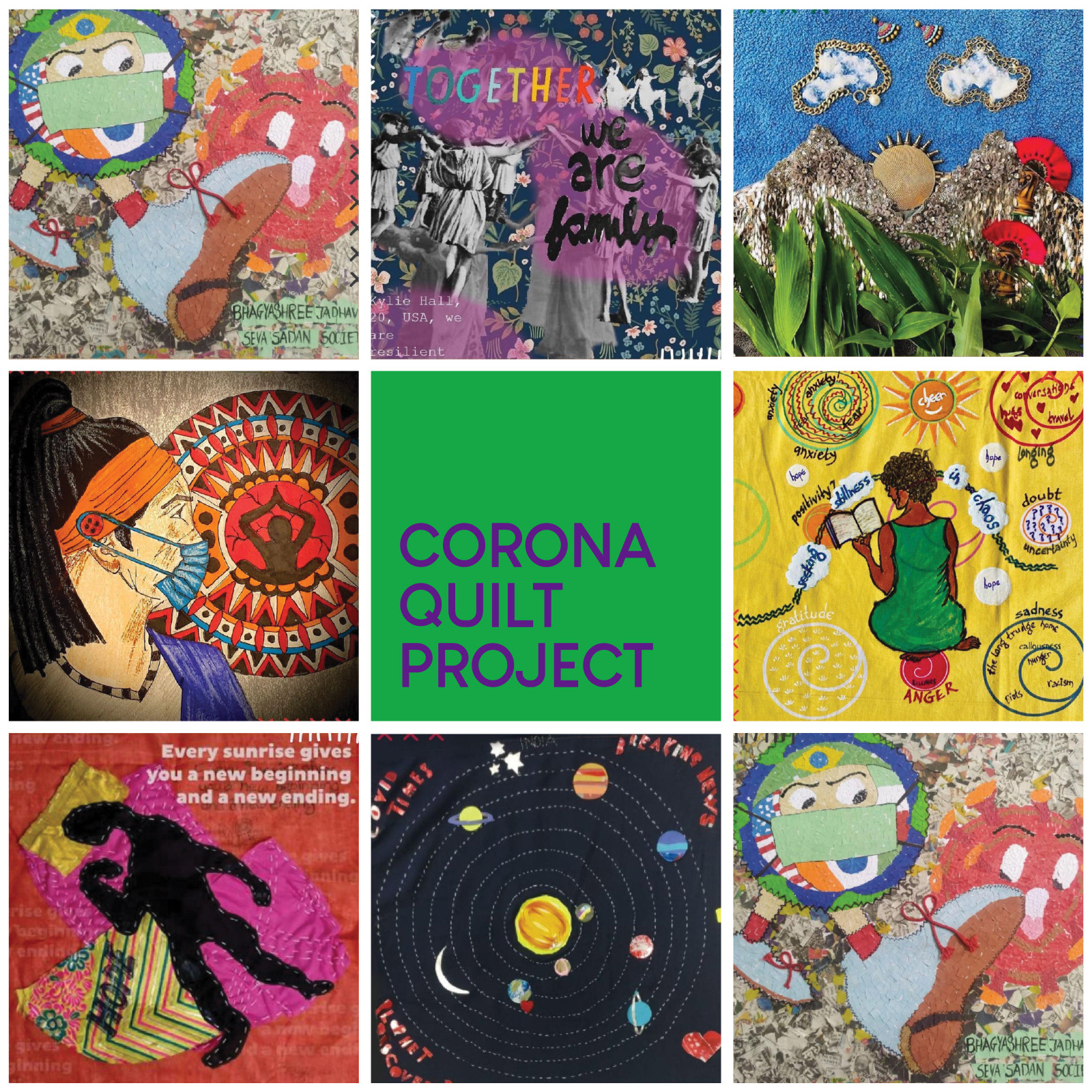
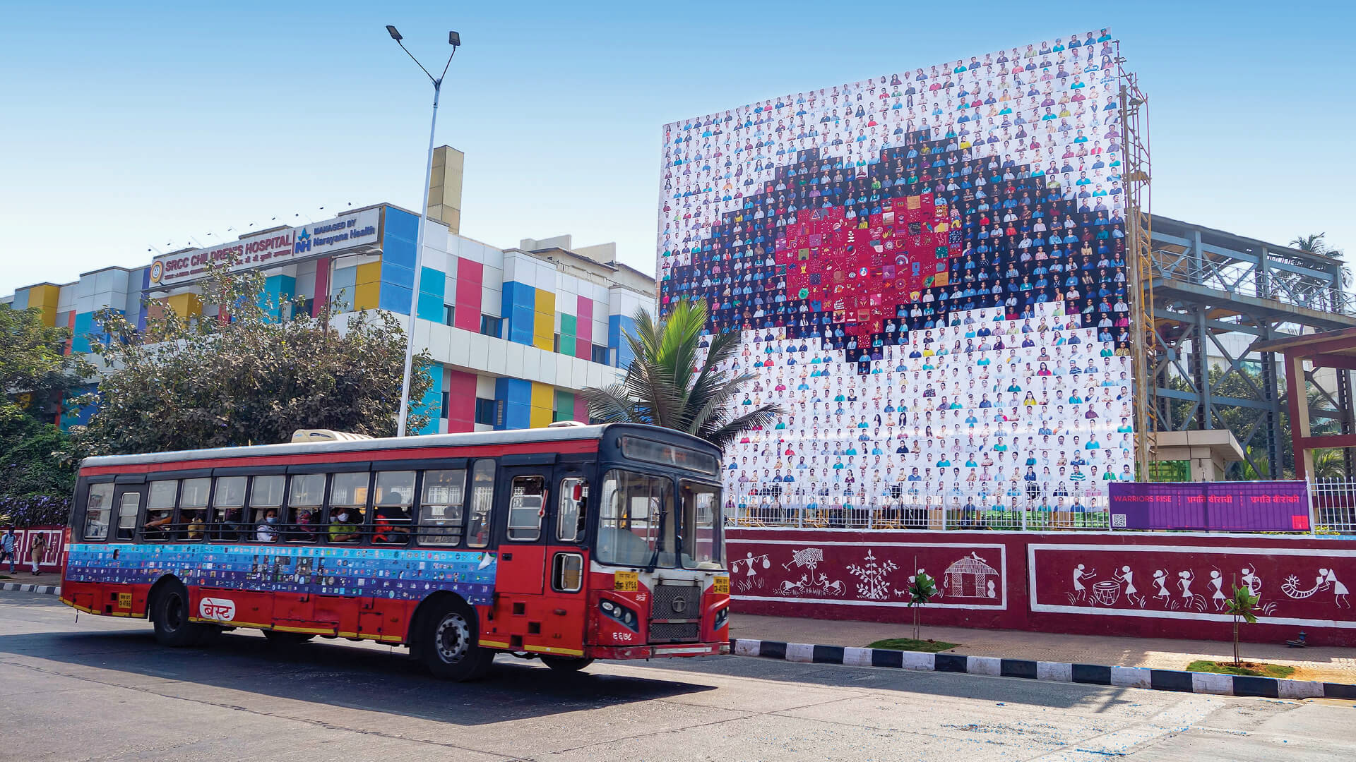
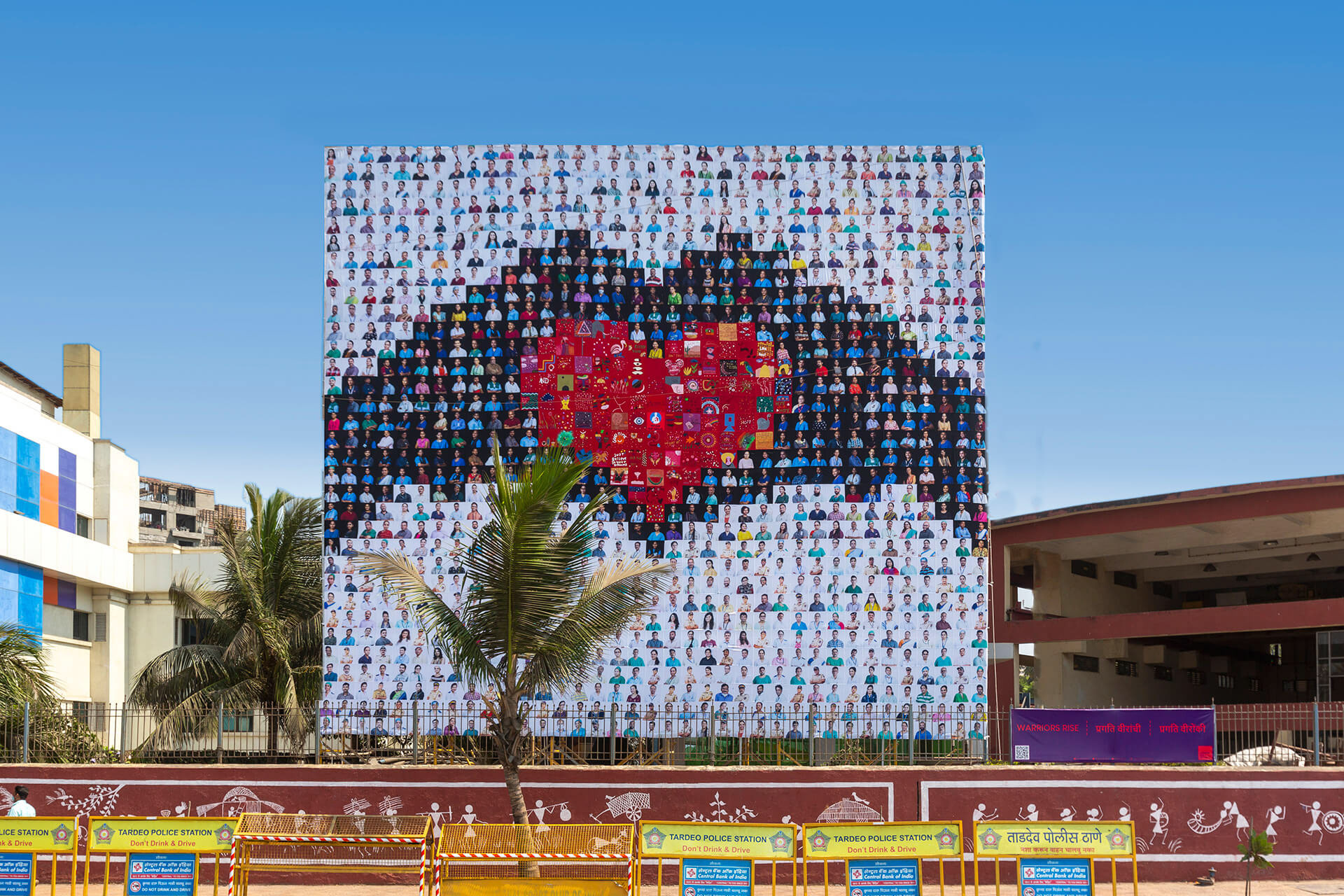
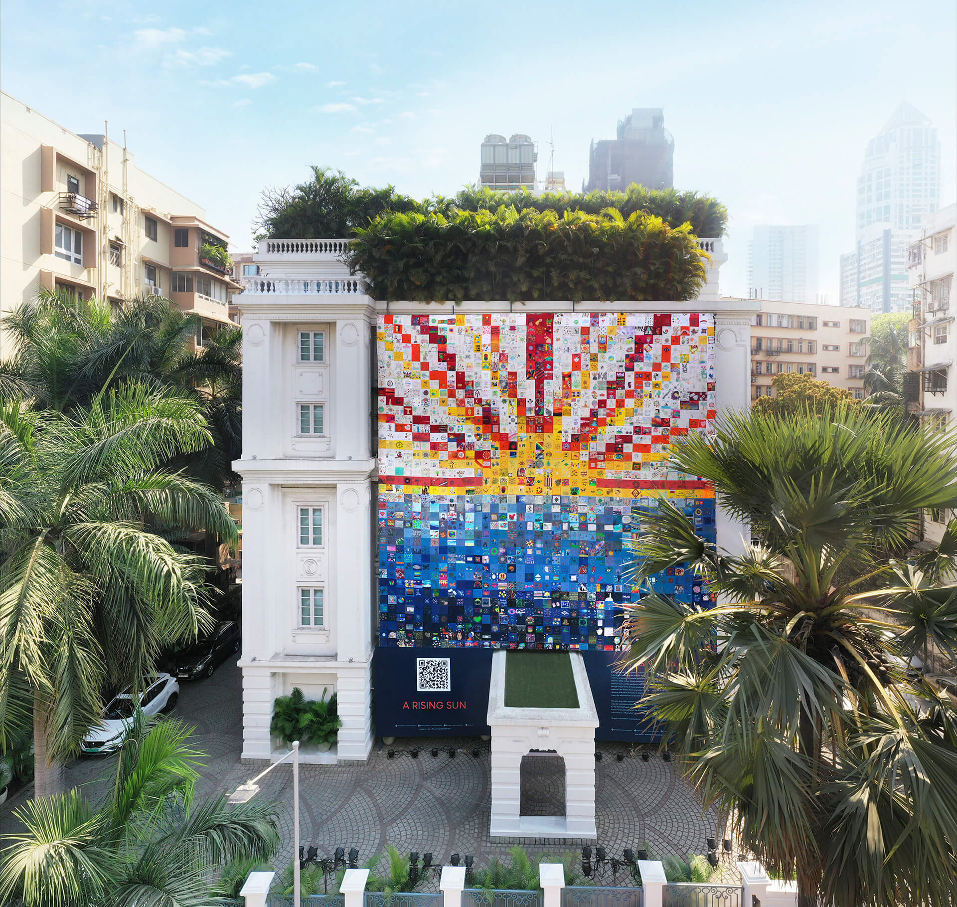
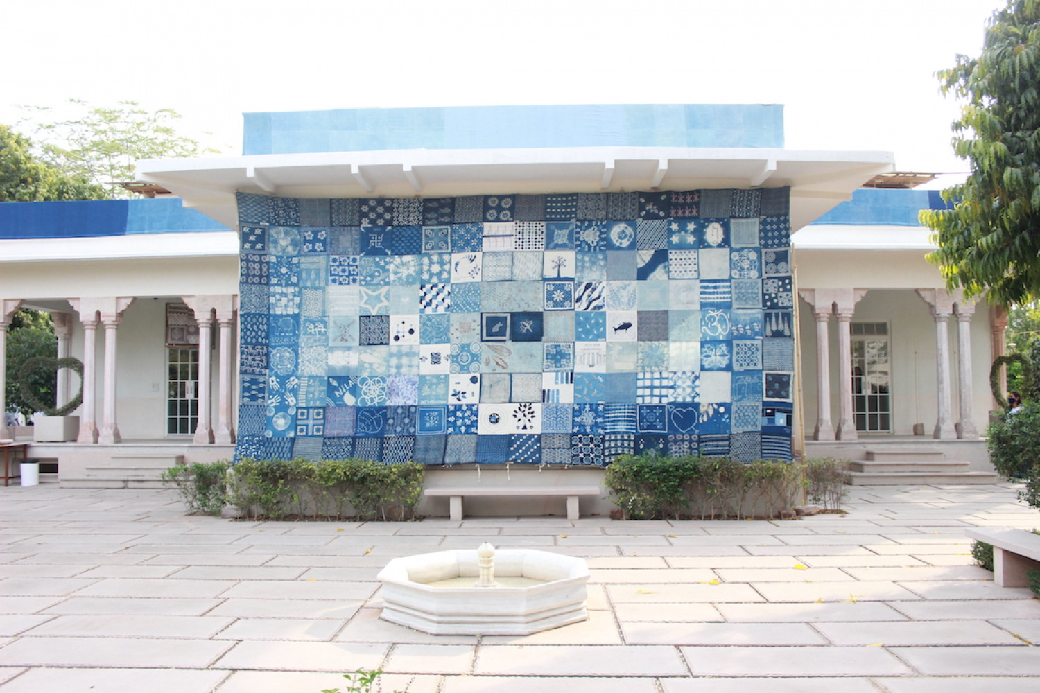
The Corona Quilt Project was conceived in the early weeks of the COVID-19 pandemic as a way to bring communities together through art. Founded in Mumbai, the project invited people to contribute handmade or digital squares of art, each one a personal expression of their experience of the pandemic. Those squares were stitched together into large-scale quilts and installed across public spaces in the city, on the facades of buildings, on buses, and at schools. What began as a small community initiative gathered over 10,000 physical and 5,000 digital contributions, and culminated in five major installations across Mumbai in 2021.
The project was covered by Vogue India, Architectural Digest, Mint, and STIRworld, among others.
The Brief
A project of this nature needed a visual identity that could do two things at once. It had to be strong enough to hold its own in a crowded public context, on building facades, at school gates, across social media, while also giving way gracefully to the actual artworks at the centre of the project. A brand that competed with thousands of individually made quilt squares would have been the wrong answer. One that disappeared into them would have been equally unhelpful.
The identity also had to work across a website, print materials, and multilingual campaign assets, serving audiences ranging from schoolchildren to arts journalists and institutional funders.
The Identity
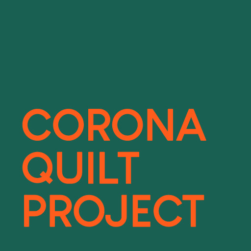
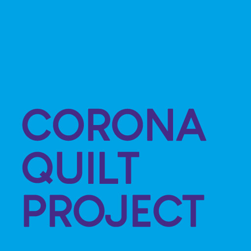
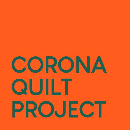
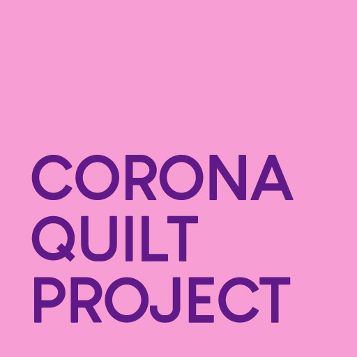
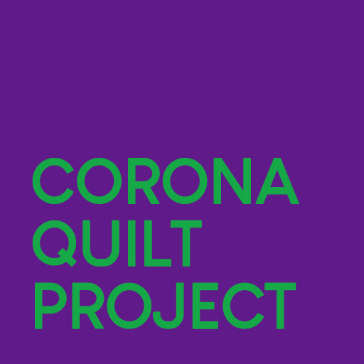
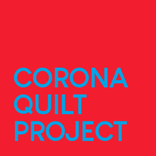
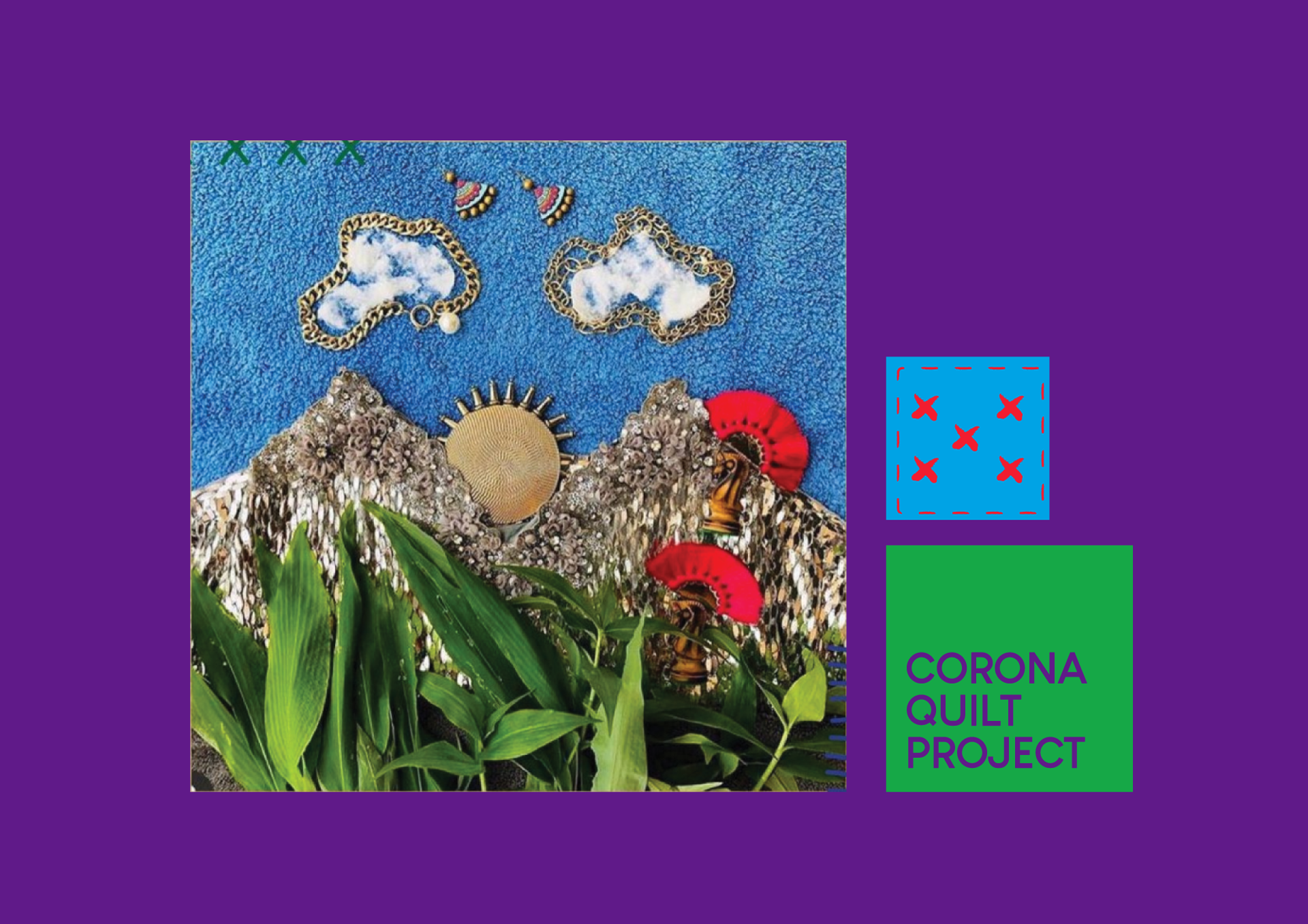
The solution was to build the brand around bold, flat colour and clean graphic geometry rather than anything decorative or illustrative. By keeping the visual language deliberately simple and structural, the identity could sit alongside the richly varied quilt artwork without trying to match or compete with it.
The quilt patch became both a structural and decorative element throughout the system, appearing in borders, layout grids, and the logo treatment in a way that connected the visual language back to the physical work without being literal about it. Alongside this, a set of stitch-based patterns was developed as visual motifs running through the identity. Drawing on actual quilting techniques including the whip stitch, running stitch, and catch stitch, the patterns were researched specifically for the project and carry a meaning that goes beyond decoration. They tie the brand visually to the craft of quilting, and quietly reference the project's central idea of individual pieces, and individual people, being stitched together into something larger.
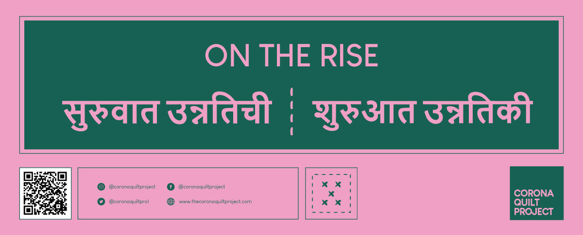
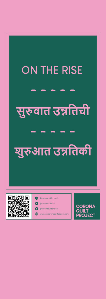
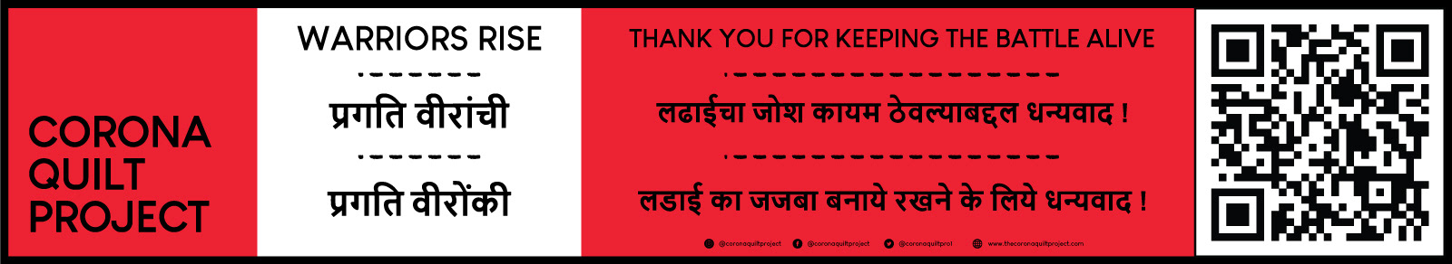
The colour palette was expansive by design. A strong primary set anchored the brand, supported by a range of secondary colours that gave different campaign materials their own visual energy while remaining clearly part of the same family. Typography was bold and unfussy, legible at large outdoor sizes and adaptable across Latin and Devanagari scripts for the multilingual materials.
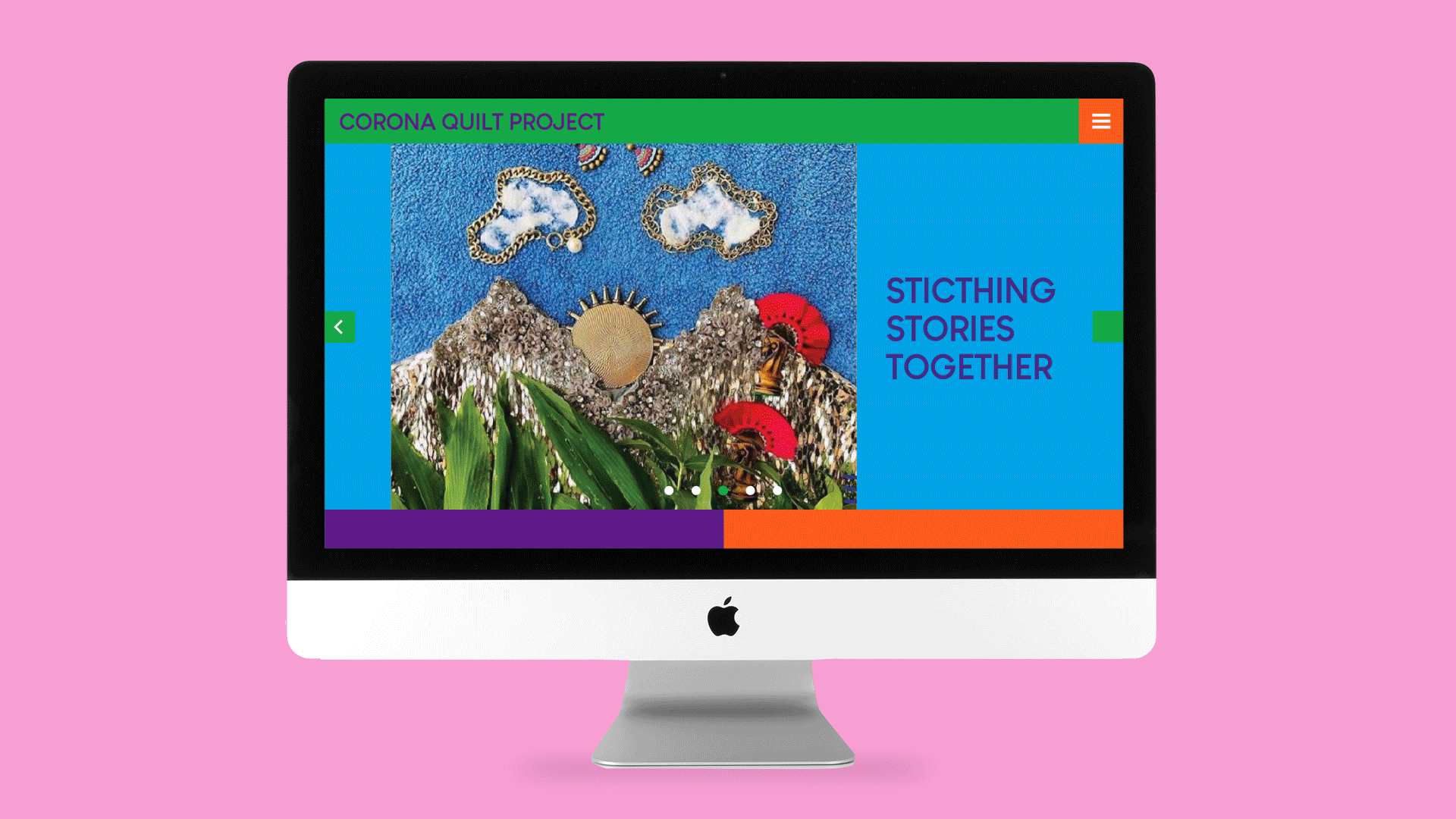
Website and Digital
The website was designed to reflect the community nature of the project, giving equal visual weight to the contributed artworks and the large-scale installations. The grid structure drew on the quilt format, with colour-blocked sections echoing the patchwork logic of the physical work. Navigation was kept simple and accessible, designed to work for a broad audience without requiring any prior familiarity with the project.
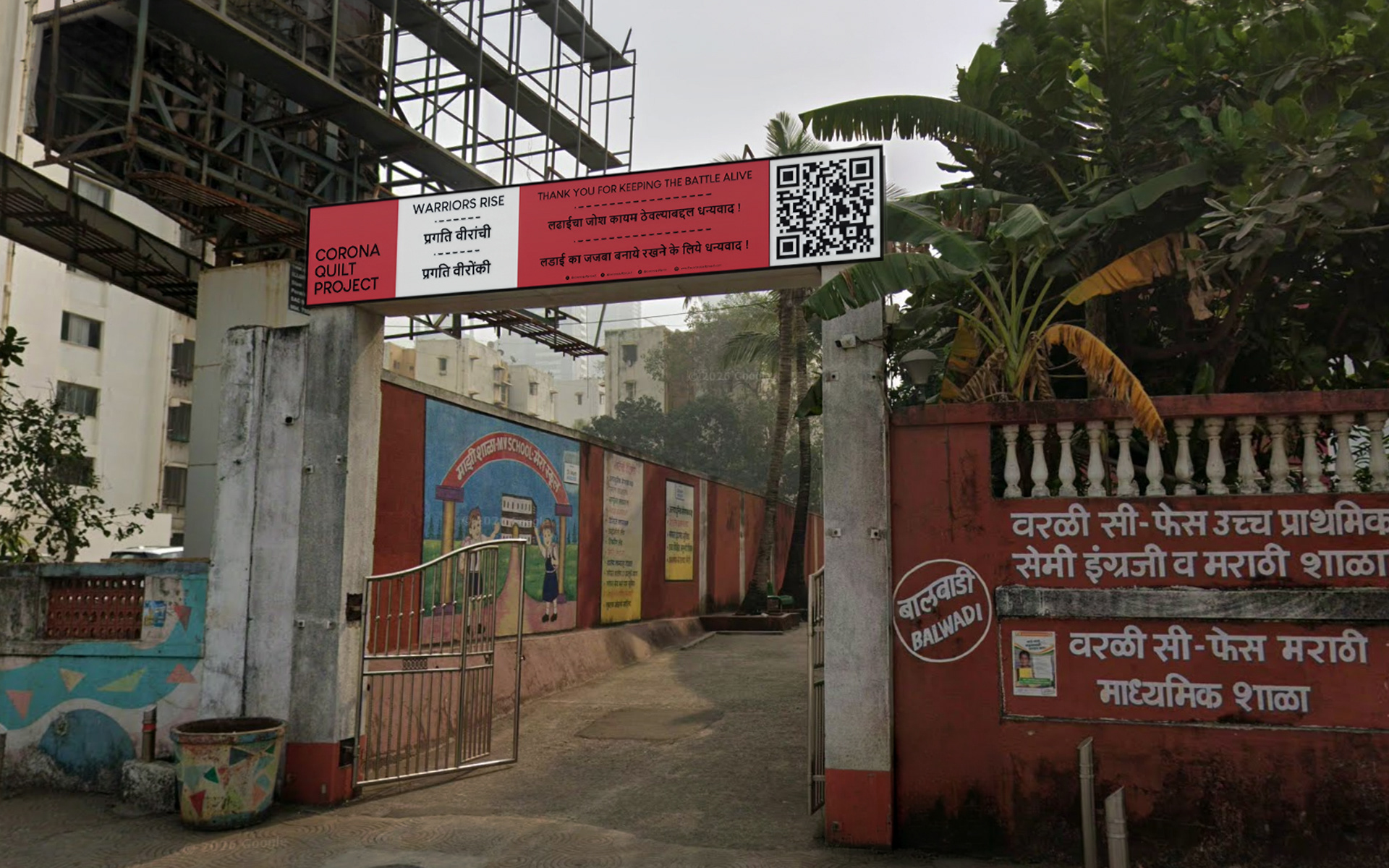
The print campaign included school gate banners, event posters, and community-facing materials across English, Hindi, and Marathi. The multilingual requirement shaped the layout approach throughout, with generous space built around text to accommodate script differences and varying line lengths without the designs feeling crowded.
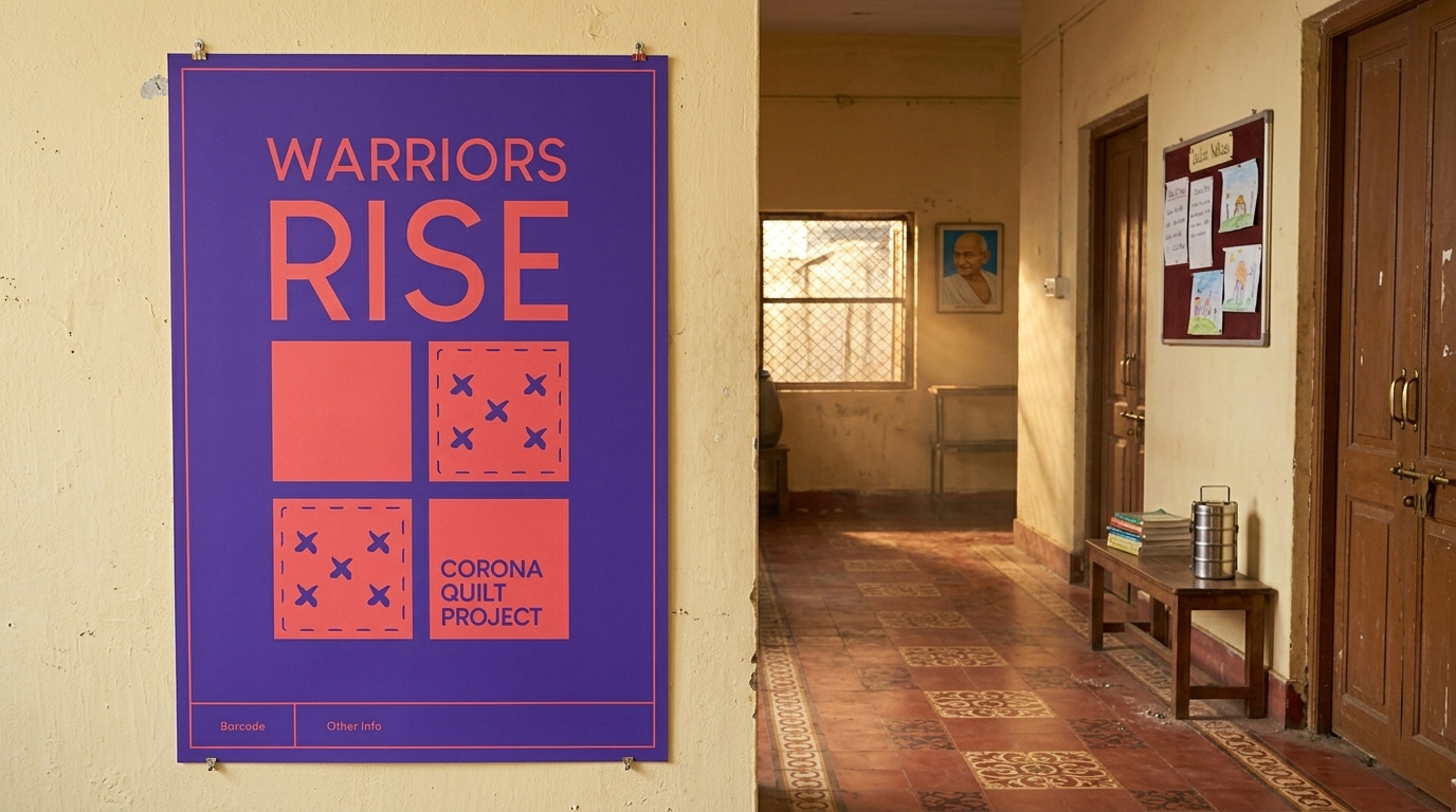
The Warriors Rise and On the Rise posters show the identity at its most graphic, using the stitch pattern motifs and bold typographic scale to create materials that could hold their own displayed outdoors at large sizes, while stepping back when placed alongside the quilt artworks themselves.
Reception
The project received widespread coverage across arts and lifestyle publications and attracted support from major sponsors including JSW, IIFL, and Godrej. The five large-scale public installations collectively incorporated thousands of individual contributions from communities across Mumbai and beyond.
