

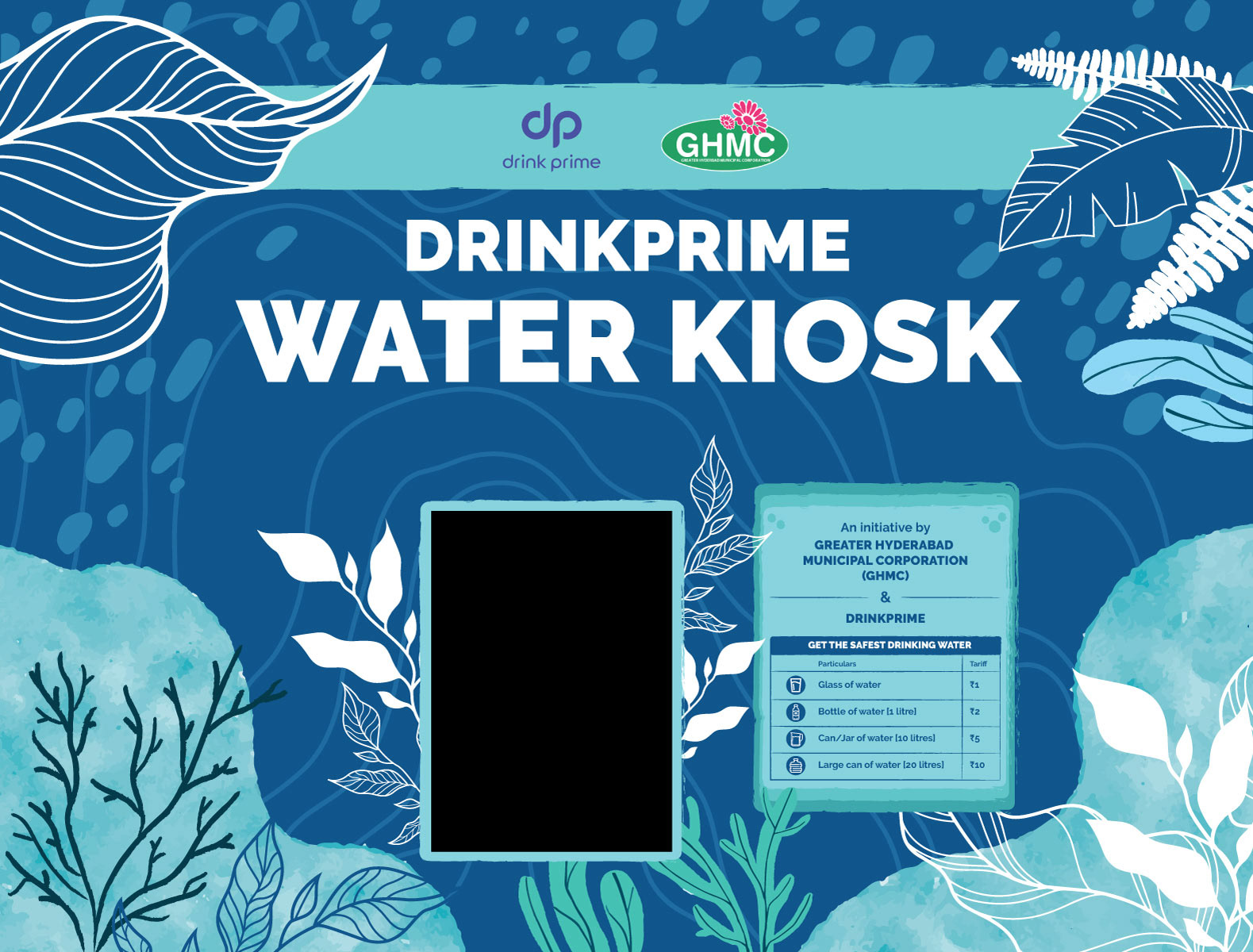


The creative direction focused on refreshing each kiosk with new visuals that communicated cleanliness, accessibility, and trust. While the designs varied across locations to reflect the diversity of the city’s neighborhoods, all followed a unifying theme centered around clean water and well-being. The DrinkPrime brand palette served as the visual anchor, ensuring consistency and recognition city-wide.
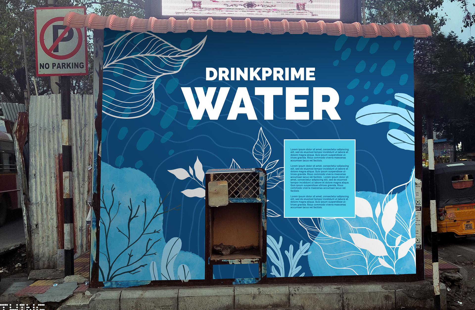
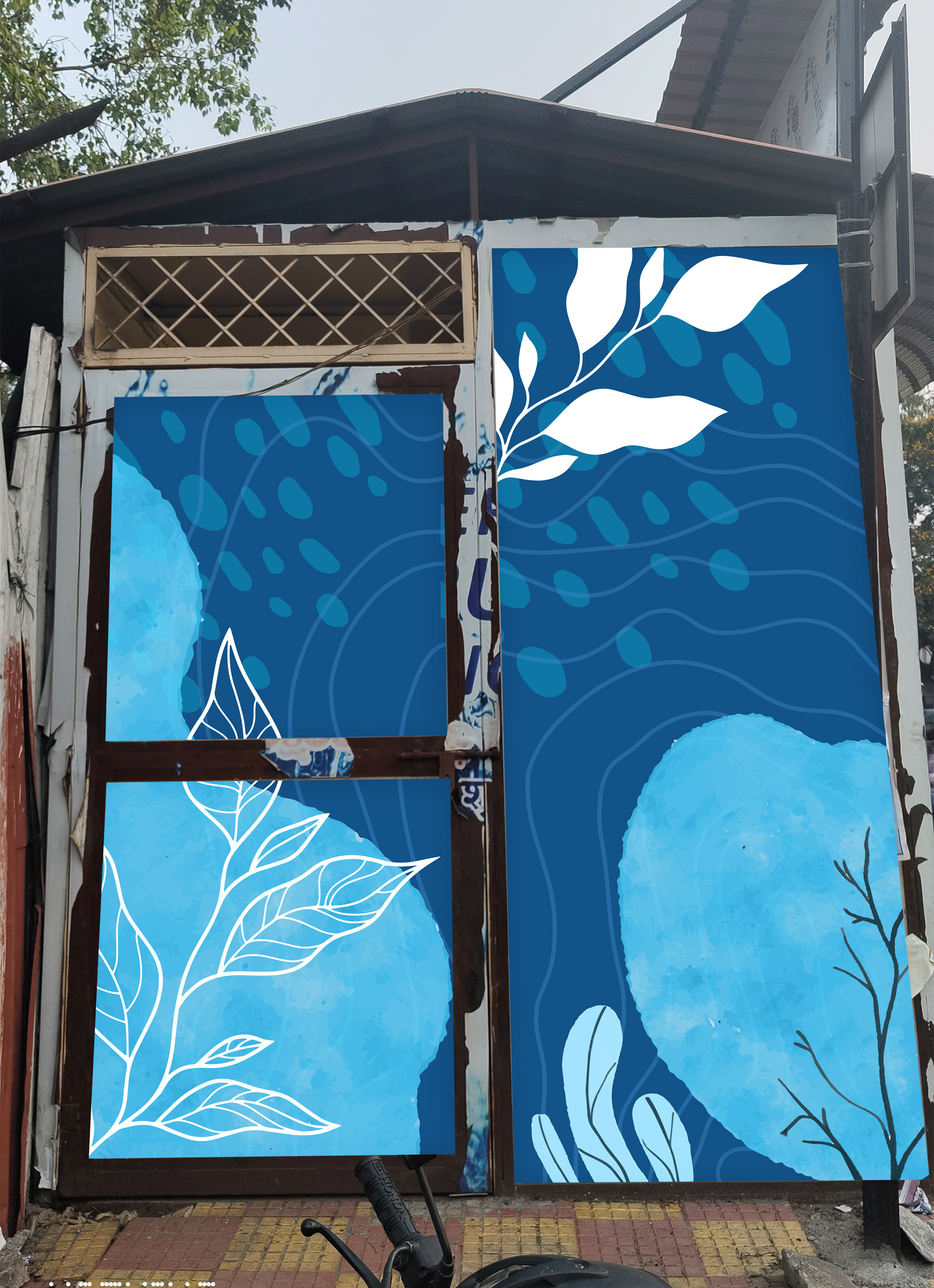
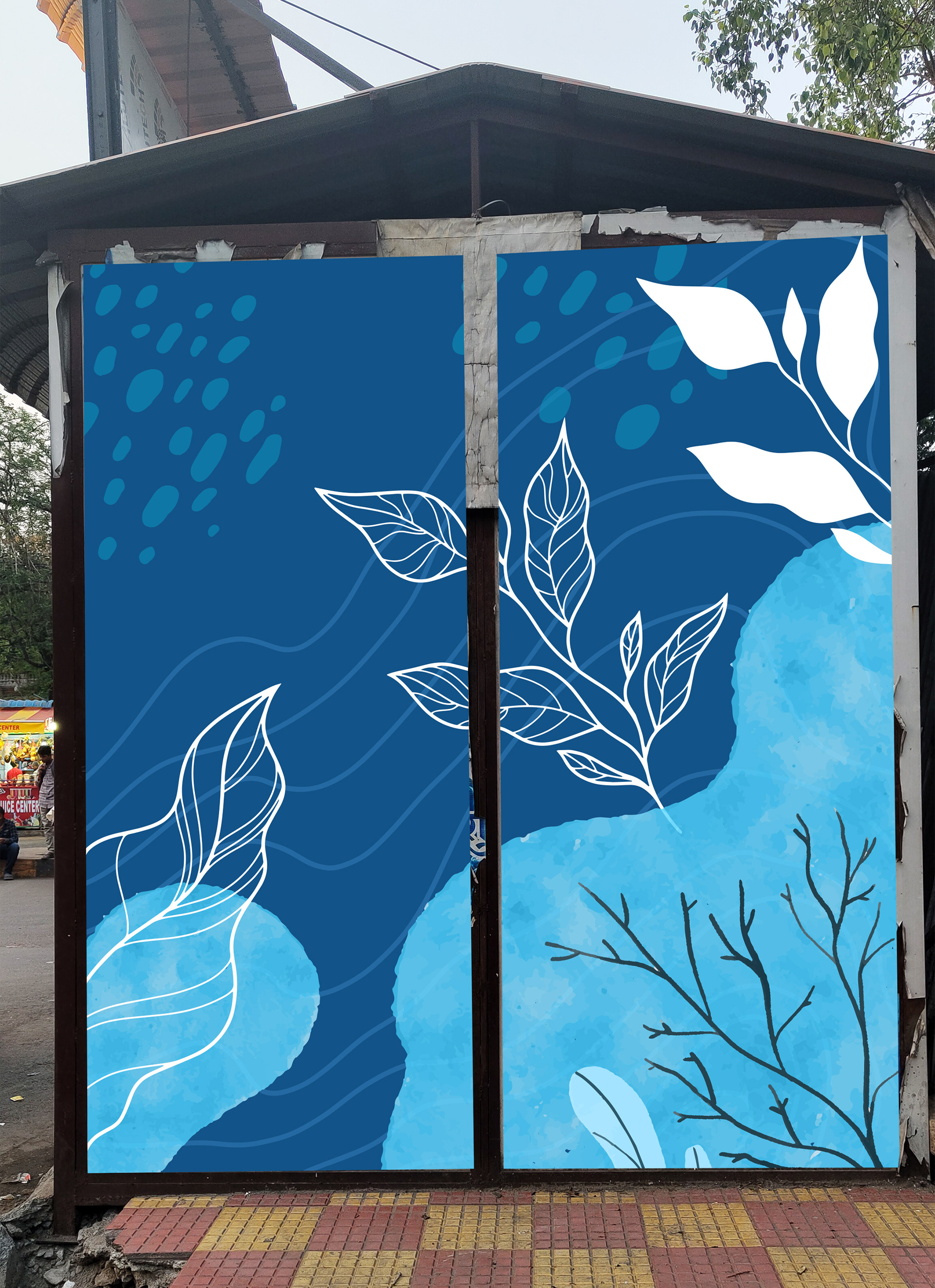

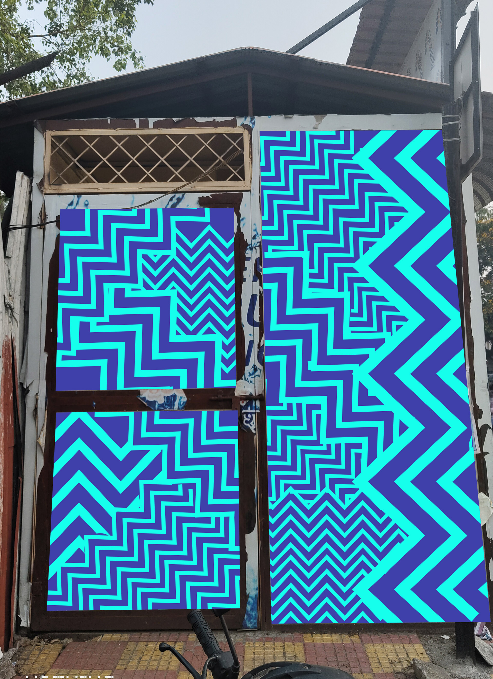
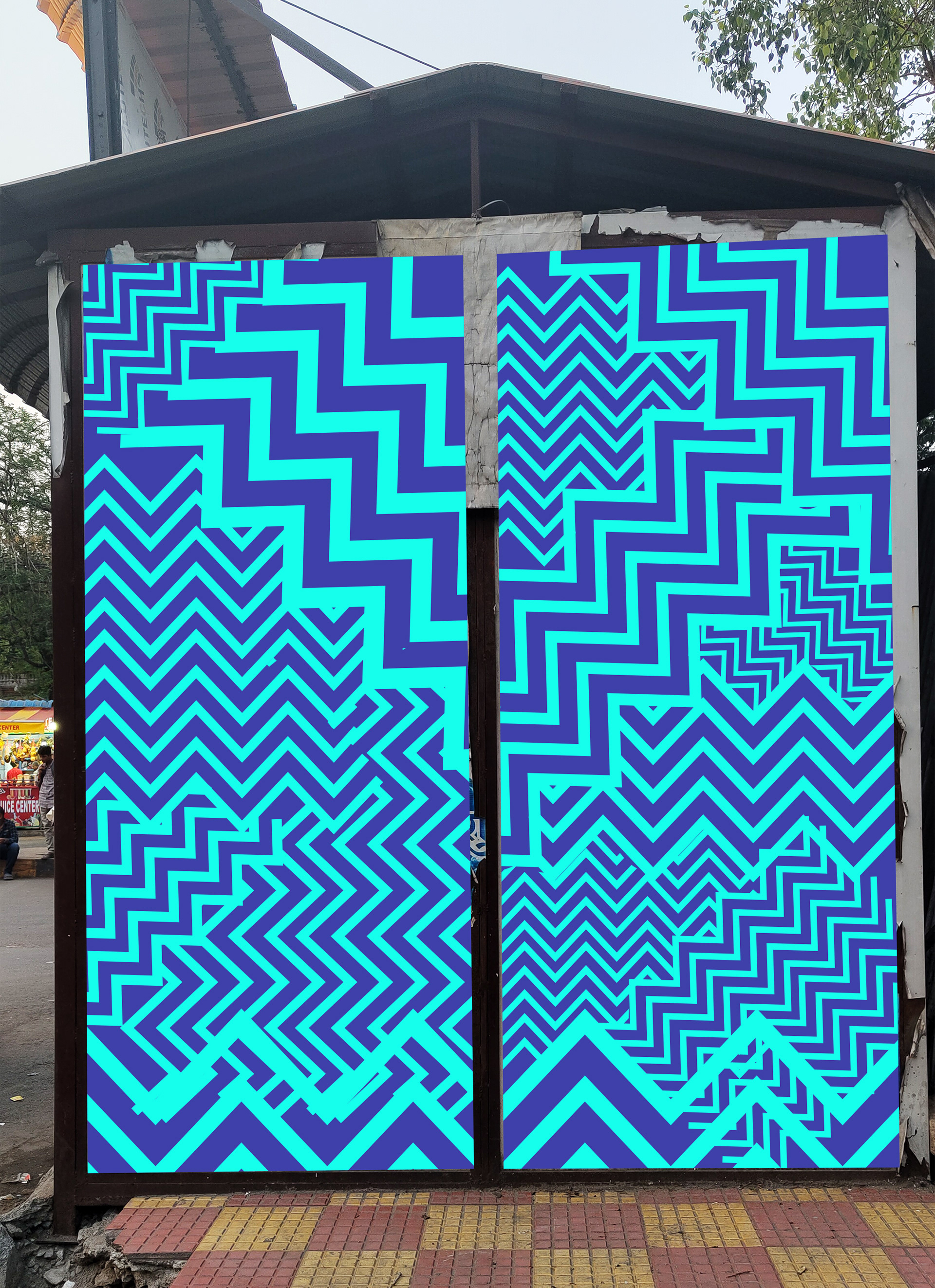
Each installation was tailored to fit the specific structure and environment of its location, blending functionality with approachable design. The result was a cohesive yet flexible visual system that helped modernize public infrastructure while reinforcing the brand’s mission of making clean water accessible to all.

