

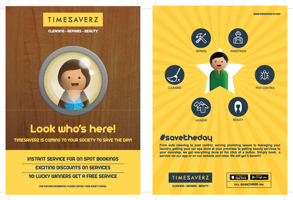
About Timesaverz
Timesaverz is an on-demand home services platform covering everything from deep cleaning and appliance repair to pest control and salon services. The project covered two connected bodies of work: a full brand identity, and a campaign system built to bring that identity to life.
The Brand Identity
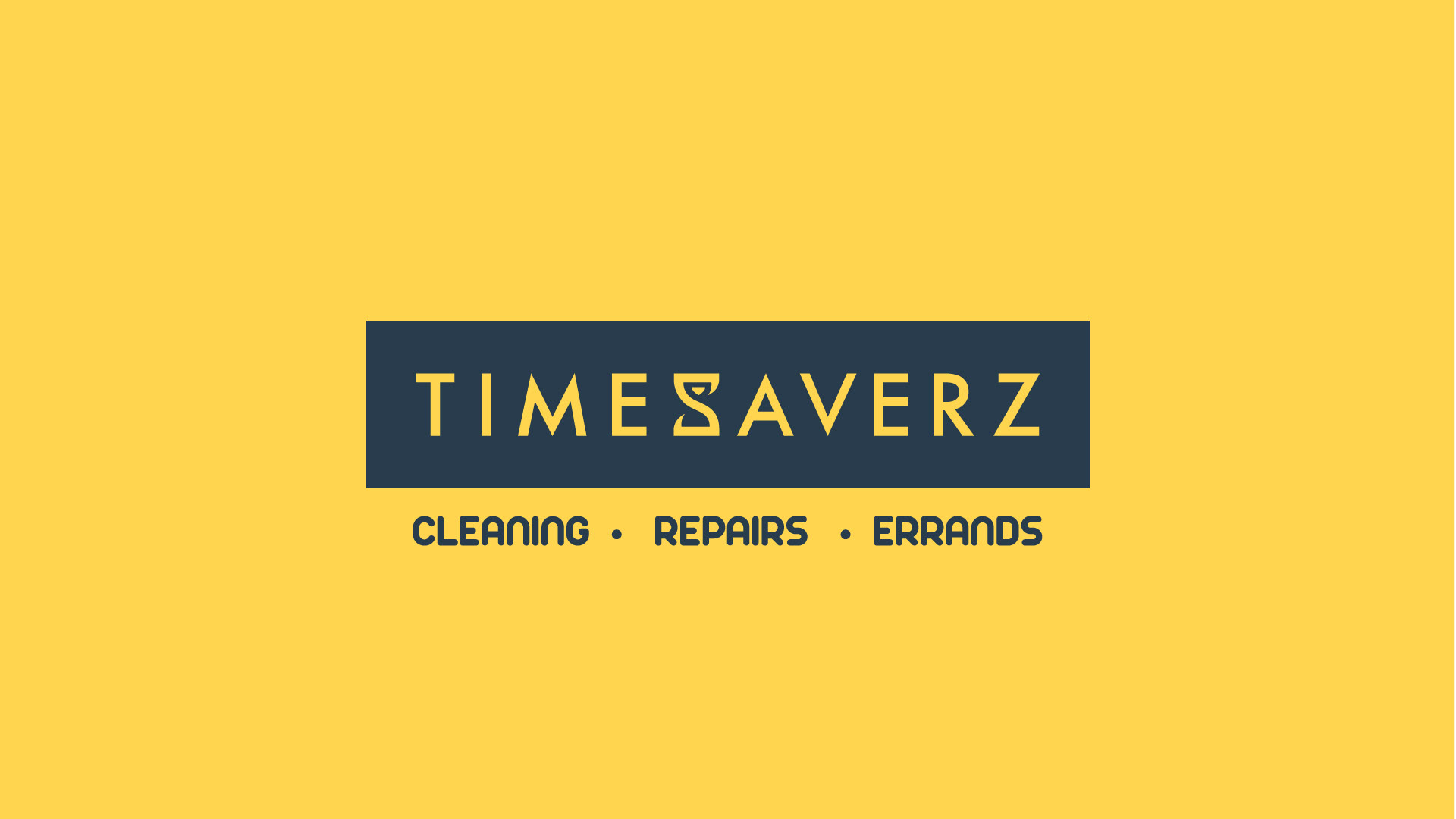
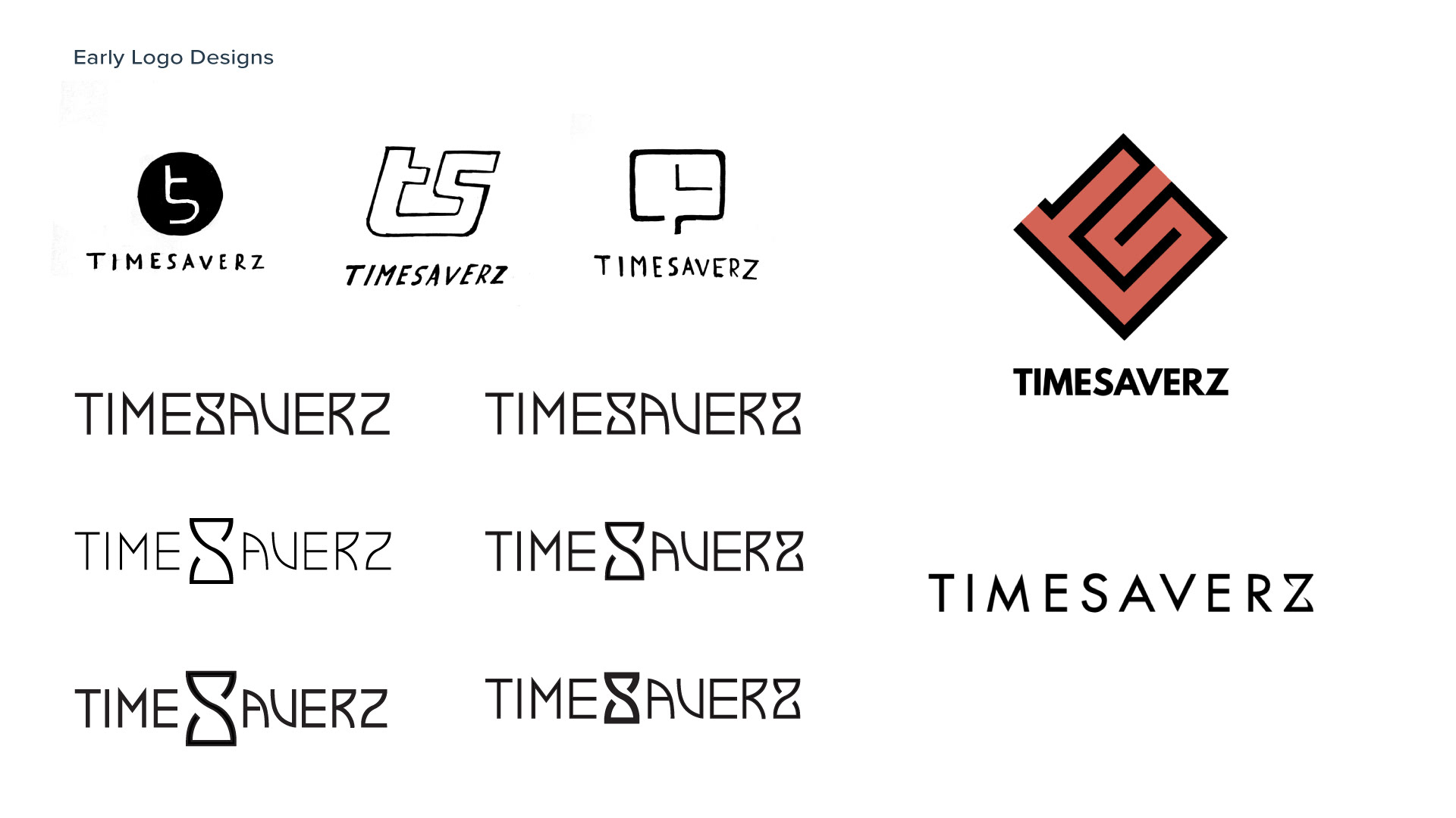
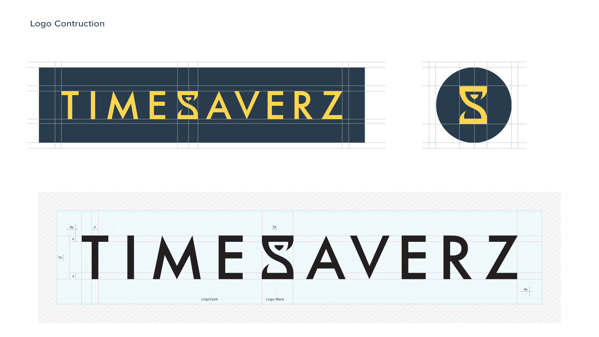
The logo started with a letterform. The S in Timesaverz had a natural affinity with the shape of an hourglass, and that became the foundation of the mark. Time is central to what the brand promises, and the icon communicates that without needing to spell it out. It works as an app icon, a web mark, or a subtle brand element in contexts where the full logo would be too much.
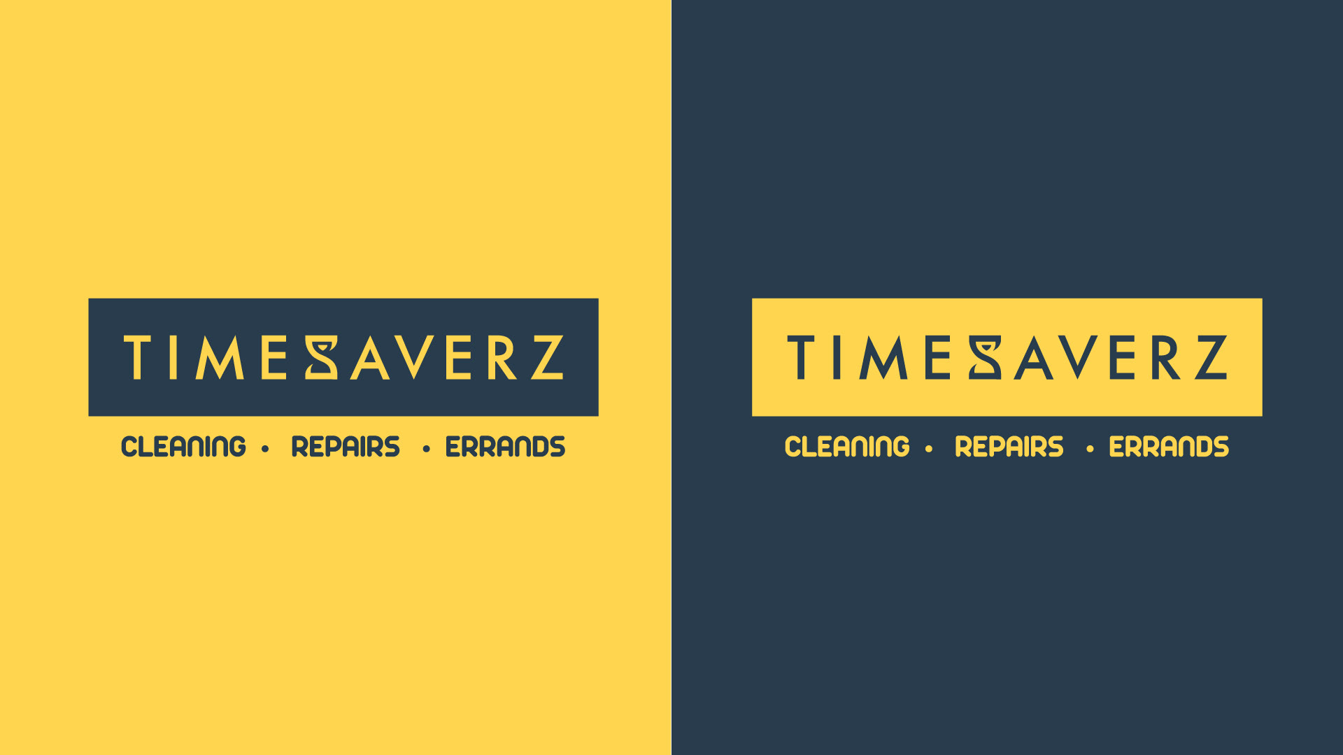
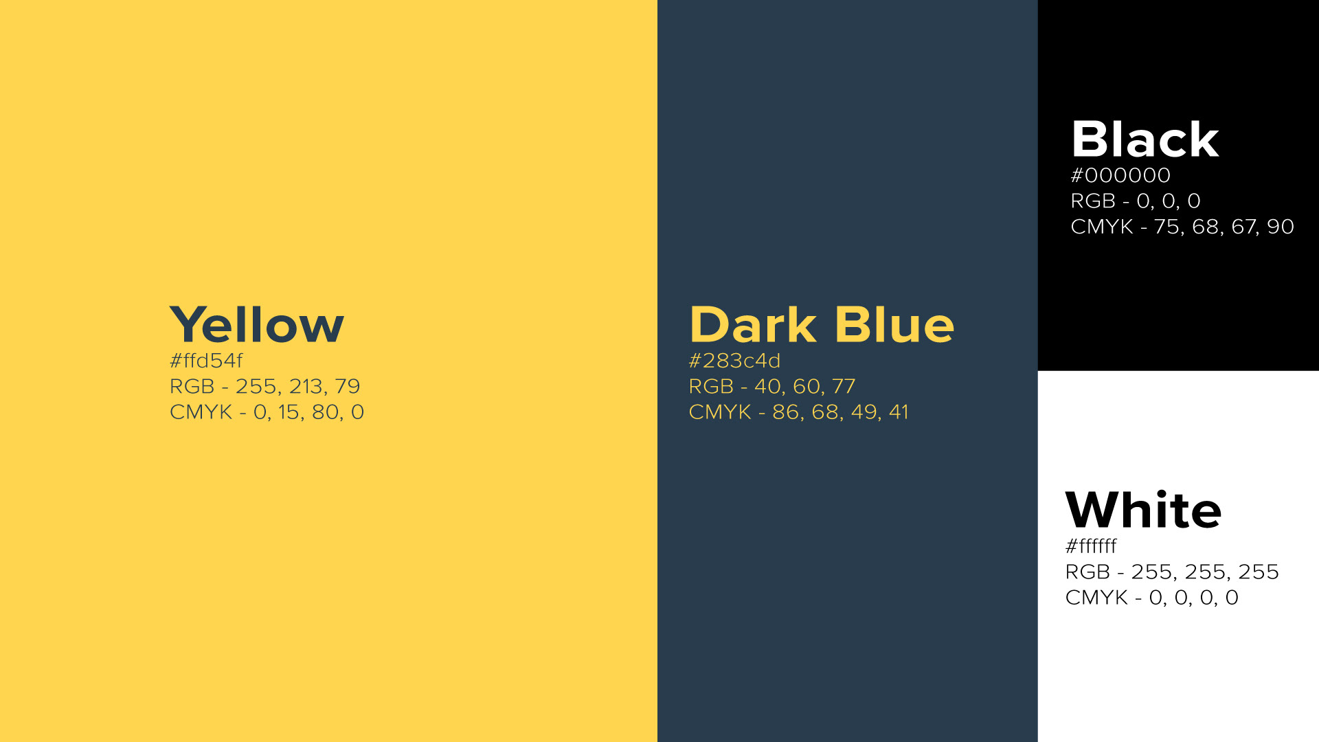
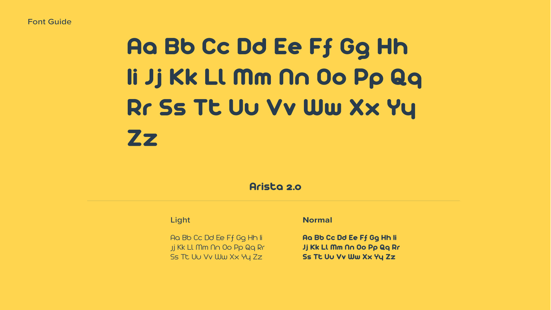
The colour palette followed a similar logic. Yellow and dark navy were chosen for their energy and warmth, qualities that felt right for a brand built around helping people with their homes. The typography was selected to feel approachable without being lightweight.

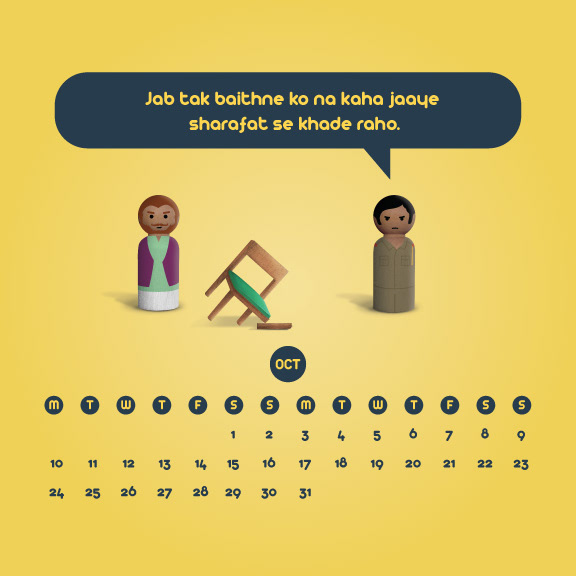
The Campaign
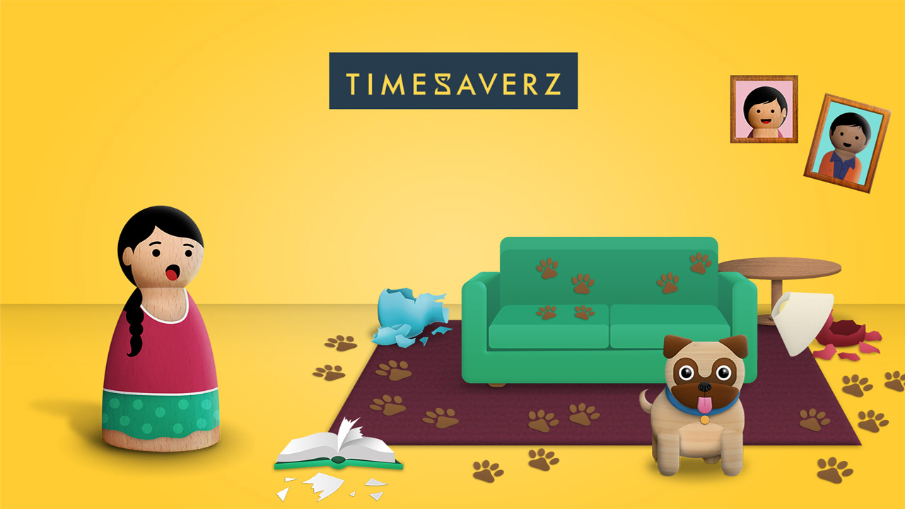
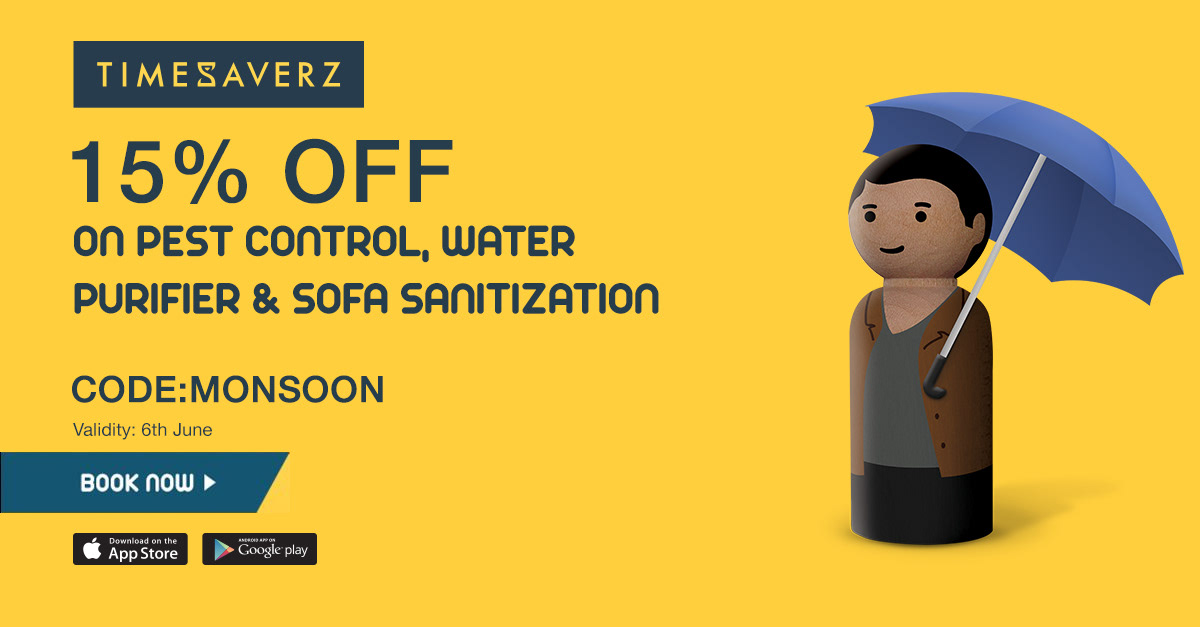
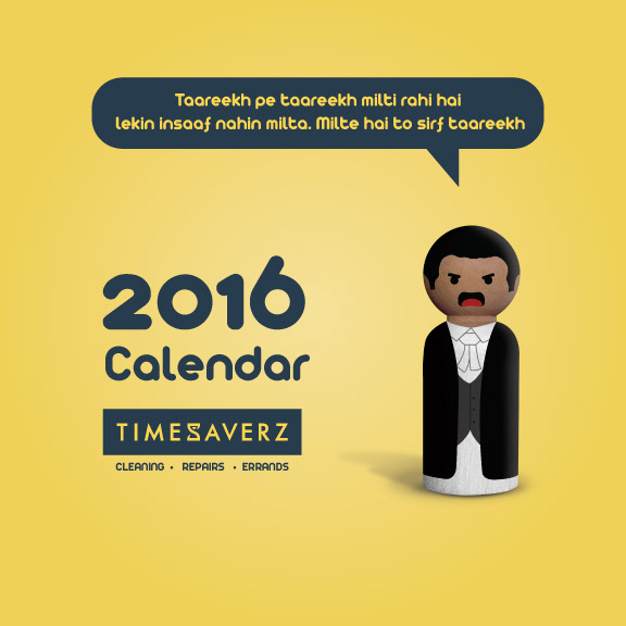
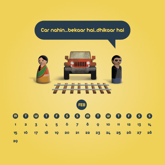
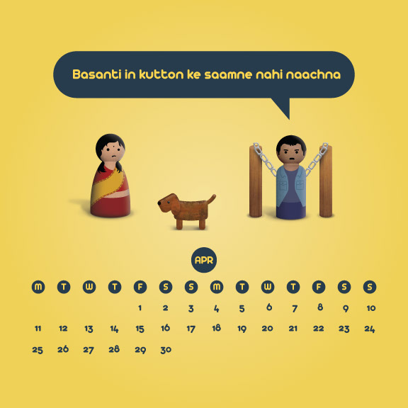
The campaign needed a visual idea that could carry the brand across a wide range of services and occasions without feeling repetitive or forced. The answer was wooden peg dolls. Hand-painted miniature characters set up in small dioramas, each one built around an everyday domestic scenario. A dog that had made a very thorough mess of the living room. An appliance giving up at exactly the wrong moment. The scenes were playful and specific, grounded enough in real life to feel familiar without taking themselves too seriously.
What made the concept genuinely useful as a campaign system was how far it could stretch. The dolls could be restyled digitally without needing a new photoshoot each time, which made ongoing content production straightforward. The same cast was adapted into a series of short animated ads that brought the diorama scenarios to life with movement and scripted moments.


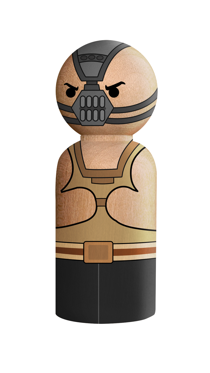
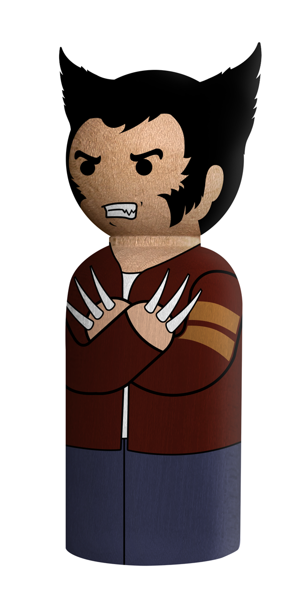
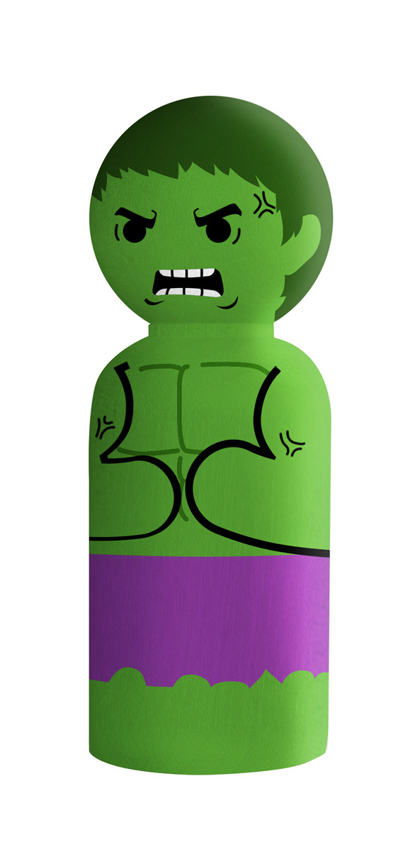
Beyond The Brief
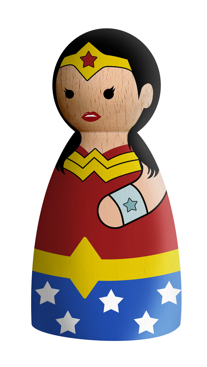
The peg doll format turned out to have range well beyond everyday home services content. The characters were reimagined as superheroes, Bollywood icons, and pop culture figures, tying the brand into festivals, film releases, and cultural moments in a way that felt natural rather than forced. The same cast that cleaned up a dog's mess one week could become an entirely different set of characters the next, without the concept losing its thread.
This flexibility kept the campaign feeling fresh over time and gave the brand a presence in cultural conversations it otherwise wouldn't have had access to.


Out in the Wild
The campaign ran across digital and print, but some of its most interesting moments were unplanned. Posters and flyers began appearing on walls, lampposts, and the backs of rickshaws around the city, not as part of a directed outdoor strategy but organically, picked up and placed there by people who had come across them. It is a difficult thing to engineer. It tends to happen when the work looks different enough from everything around it that people want to share it.
The peg doll system continued to be built upon and extended well beyond the initial campaign, with new scenarios, characters, and adaptations added over time. That kind of longevity usually comes down to whether the original idea was strong enough to keep giving. In this case it was.